
I was part of the ambitious team at Moni to provide financial services to excluded demography in Nigeria. I spearheaded wireframing, high-fidelity design, and overall user experience from end to end.
I was part of the ambitious team at Moni to provide financial services to excluded demography in Nigeria. I spearheaded wireframing, high-fidelity design, and overall user experience from end to end.
Despite efforts in Nigeria's fintech space, many Nigerians still lack basic financial services. To address this issue, I designed an end-to-end user experience that leverages existing infrastructures to provide financial services to underserved communities.
Team
The team comprised two product managers focused on the business aspect, a storytelling copywriter who make sure the app communicated properly to the target audience, and a design manager who managed the entire project.
Skills
During the project, I utilized various abilities such as competitive analysis, wireframing, user testing, UI design, and prototype creation.
Access to financial services in Nigeria is highly unequal, with high net-worth individuals enjoying tailored financial management, while a significant portion of the population remains unbanked. To address this problem, leveraging the existing agency system, similar to POS operators, is crucial. These agents will act as intermediaries offering vital financial services and serving as account managers for the unbanked.
The problem
41%
of Nigerians are unbanked with ₦26.17 trillion outside the banking system. 4 out of 10 people are unbanked (44% of the population).
The solution

Leveraging the existing agency framework & maximizing the agents’ penetration and understanding of their communities.
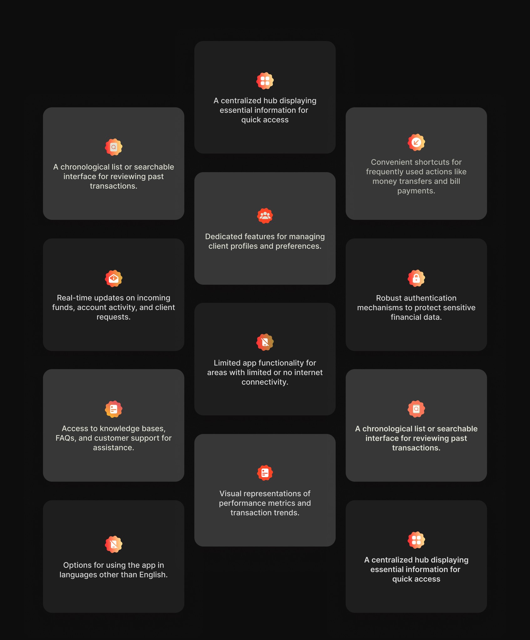
After examining other agency applications in the finance space, I discovered common design patterns. These include unified dashboards, transaction history, quick actions, client management, notifications, secure authentication, offline mode, help and support, analytics, and multilingual support.
Designing for efficiency, and accuracy while minimizing errors.
Implementing robust security measures to instil user confidence.
Designing intuitive and streamlined workflows to ensure a seamless user experience.
information HIERARCHY
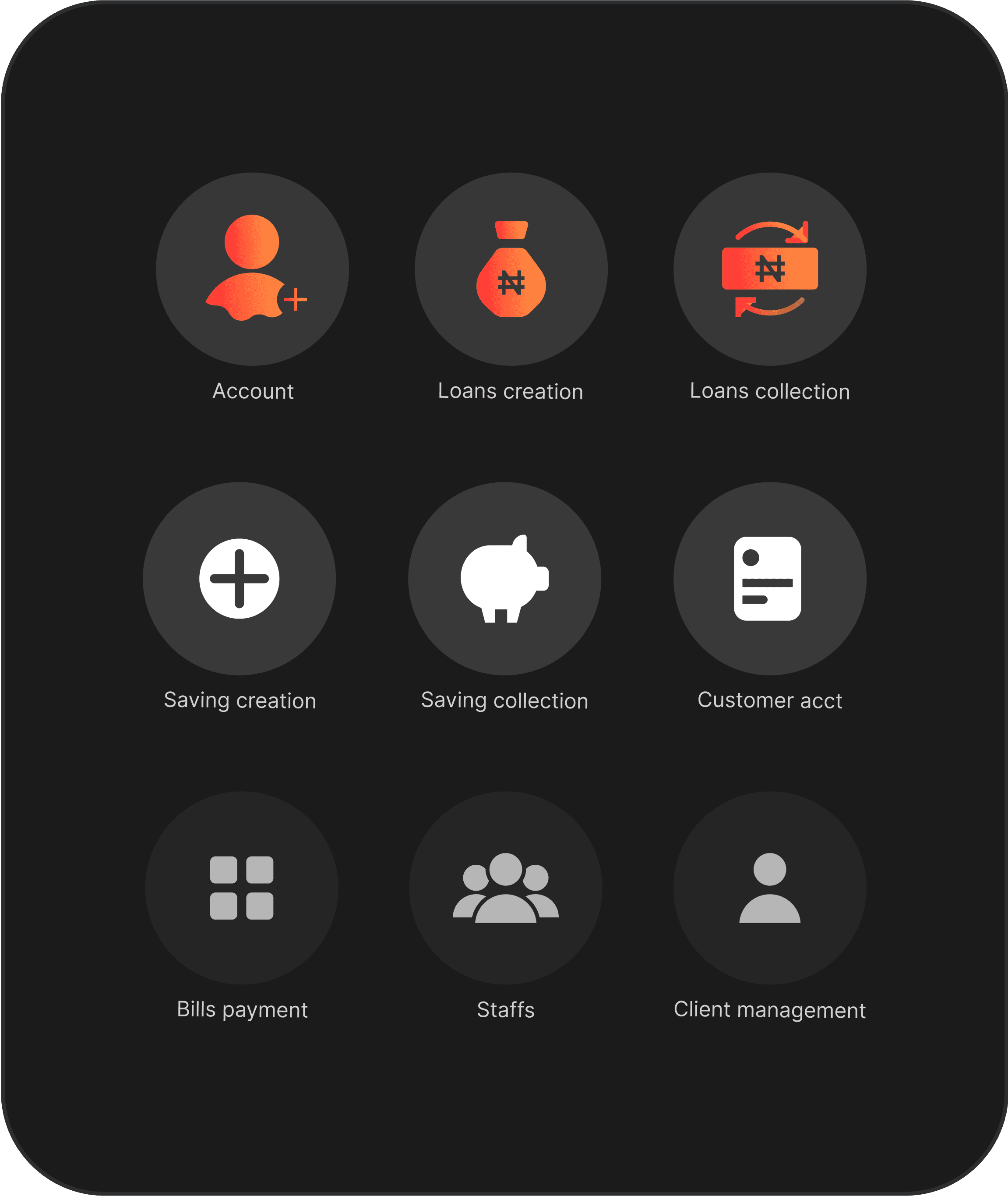
I identified the key actions that agents need to take and optimized the interface to prioritize these actions.
Page STRUCTURE
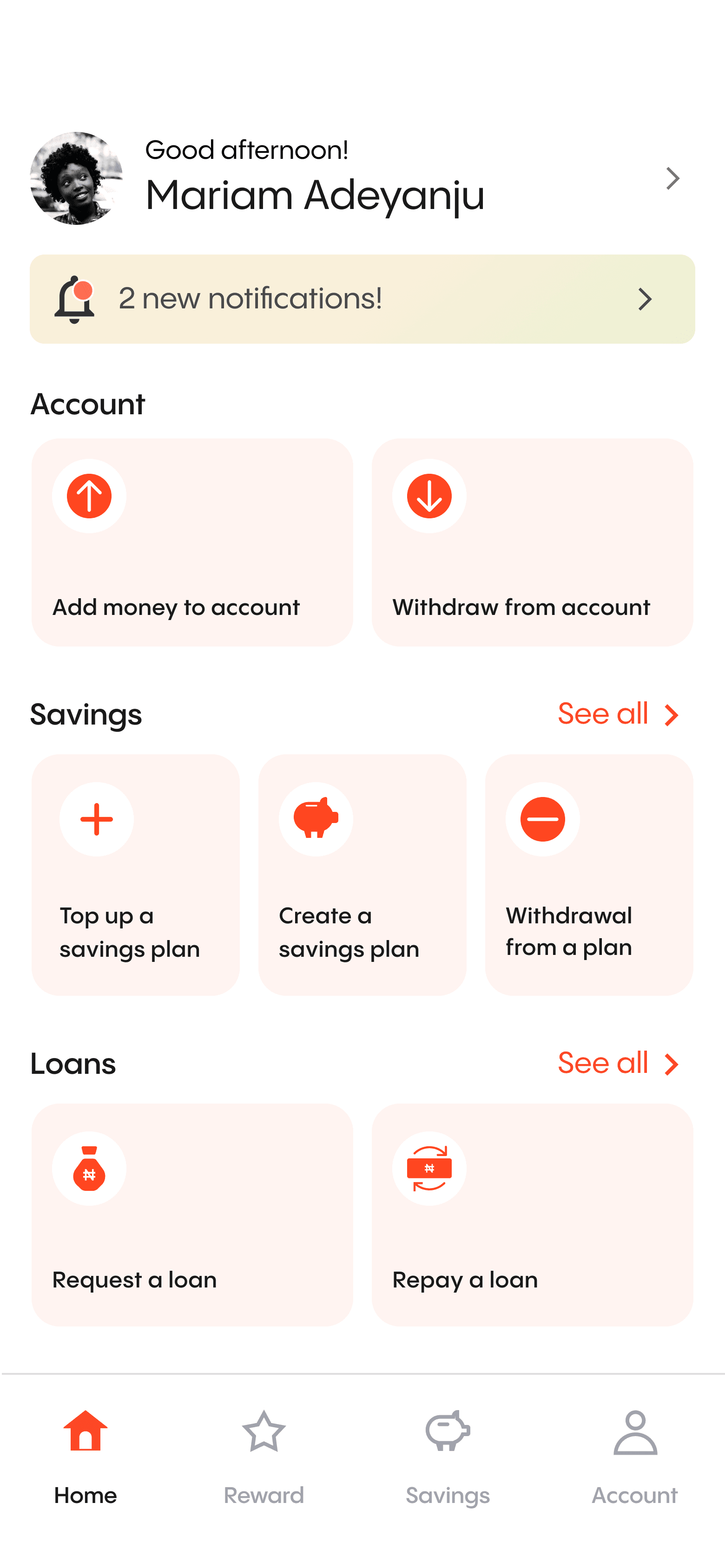
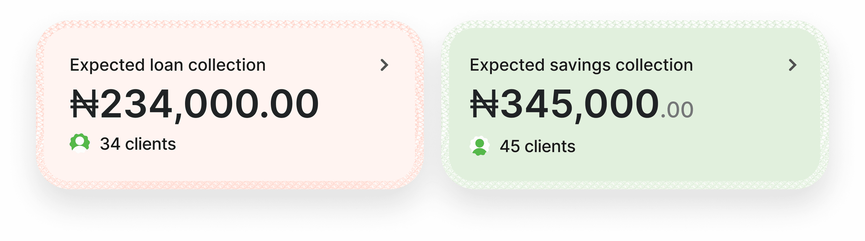
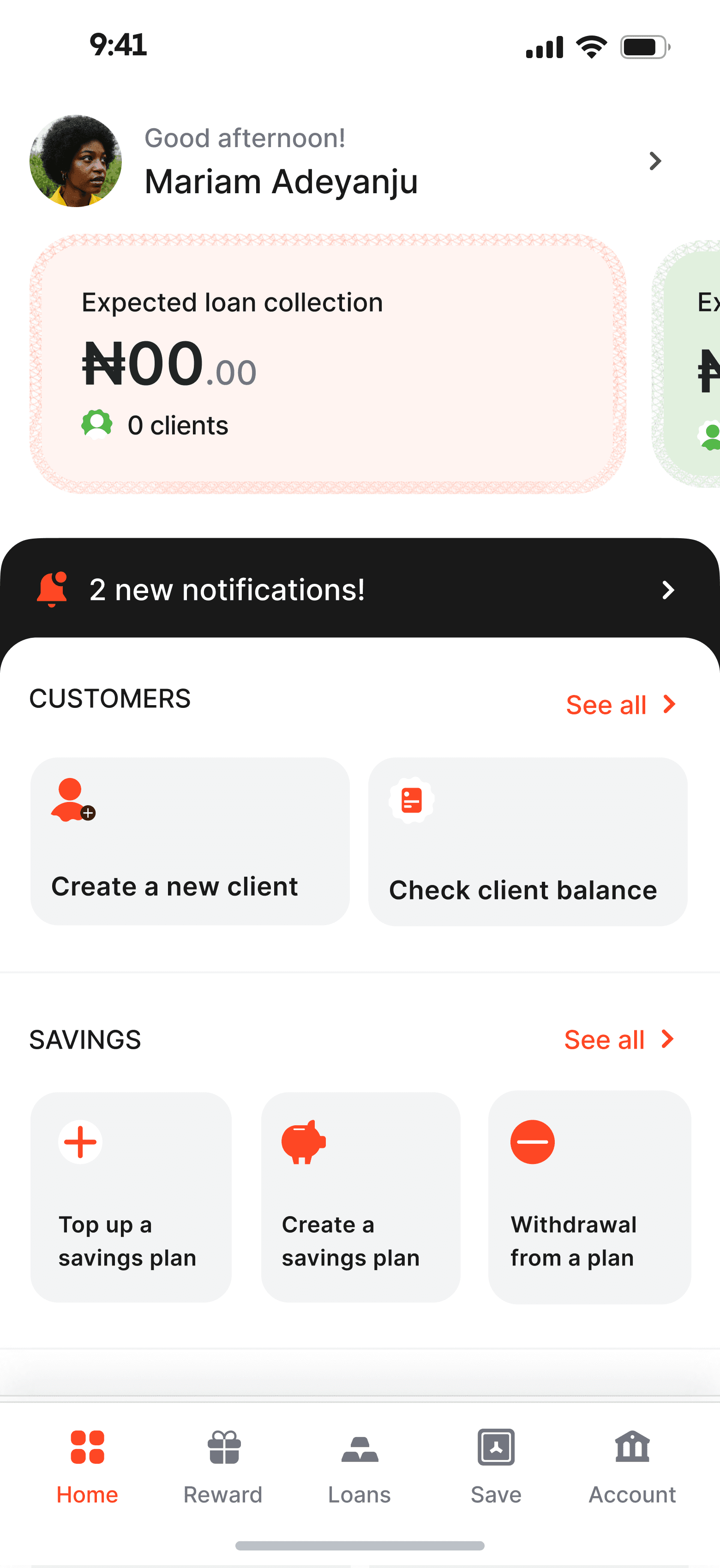
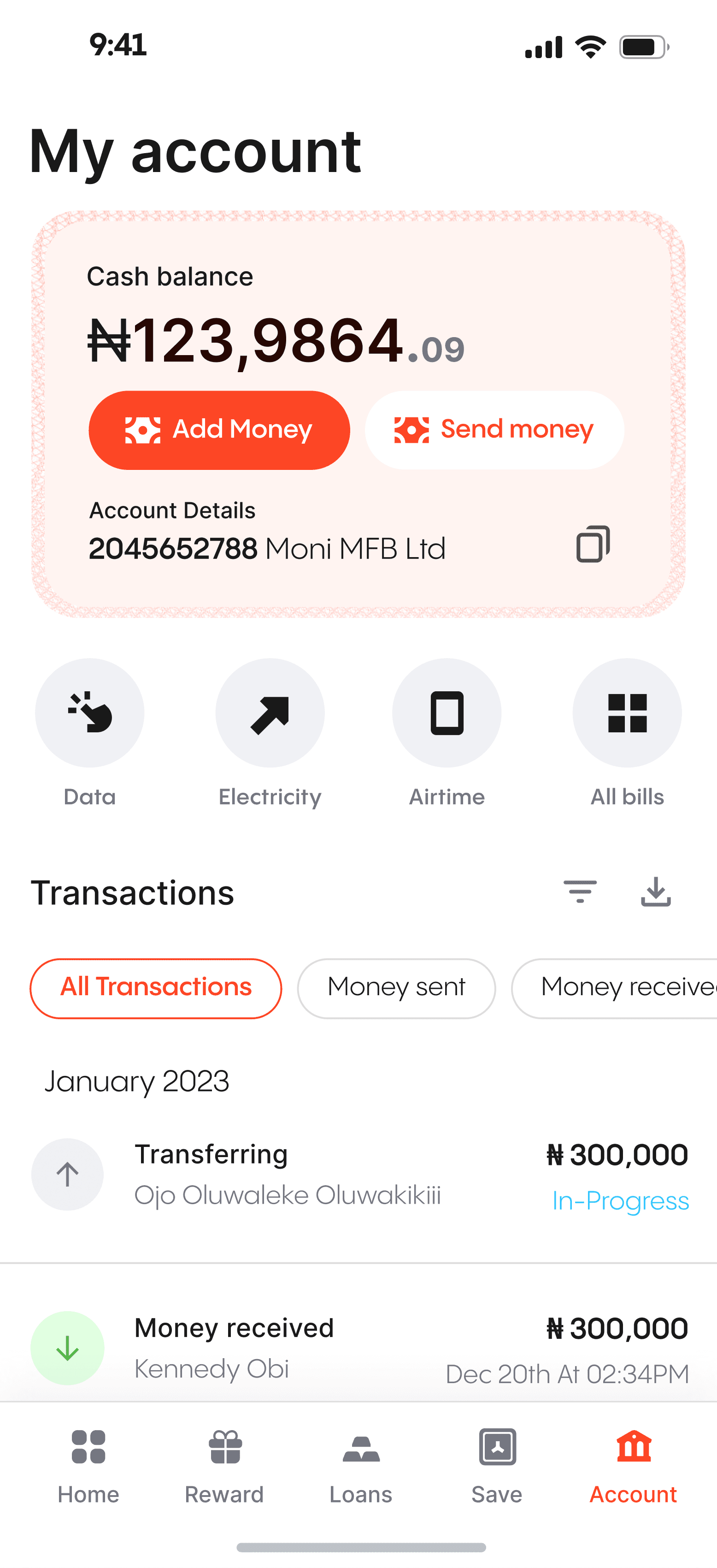
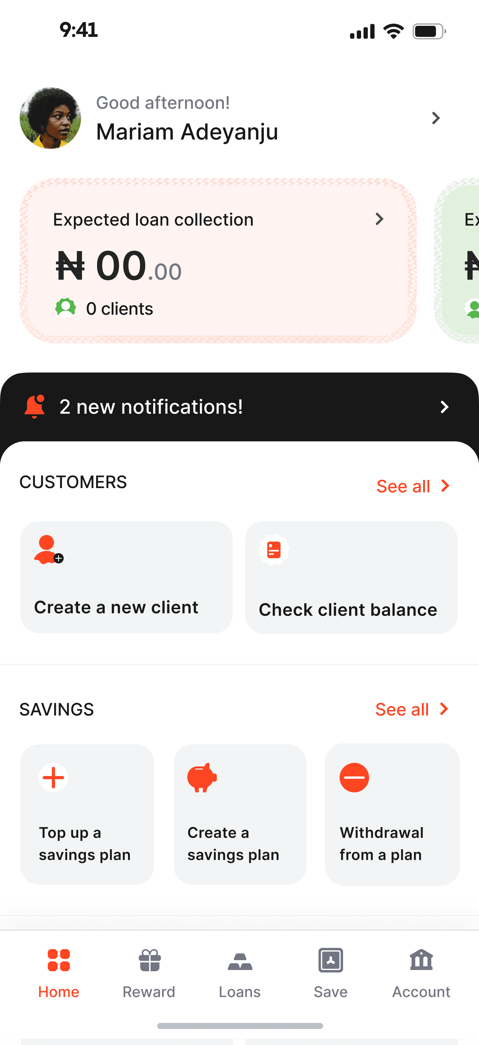
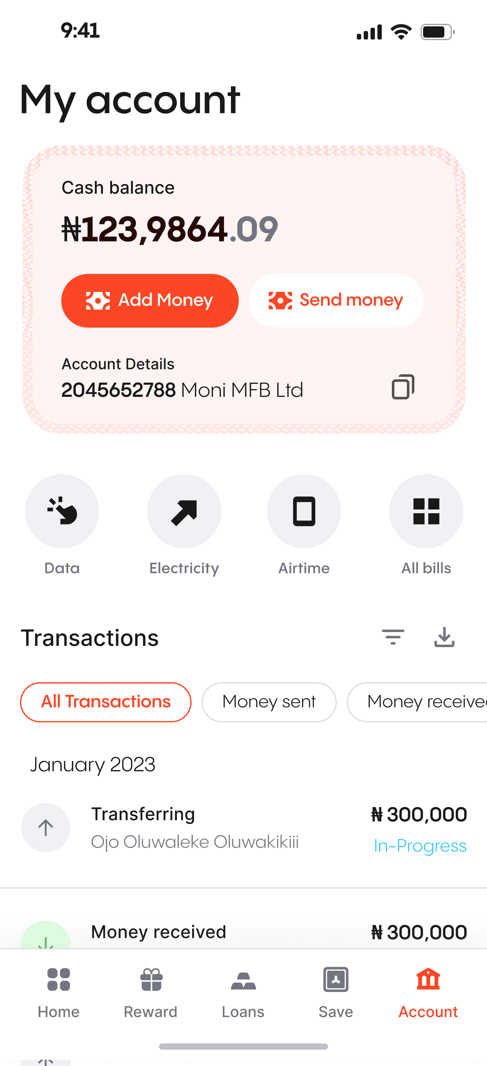
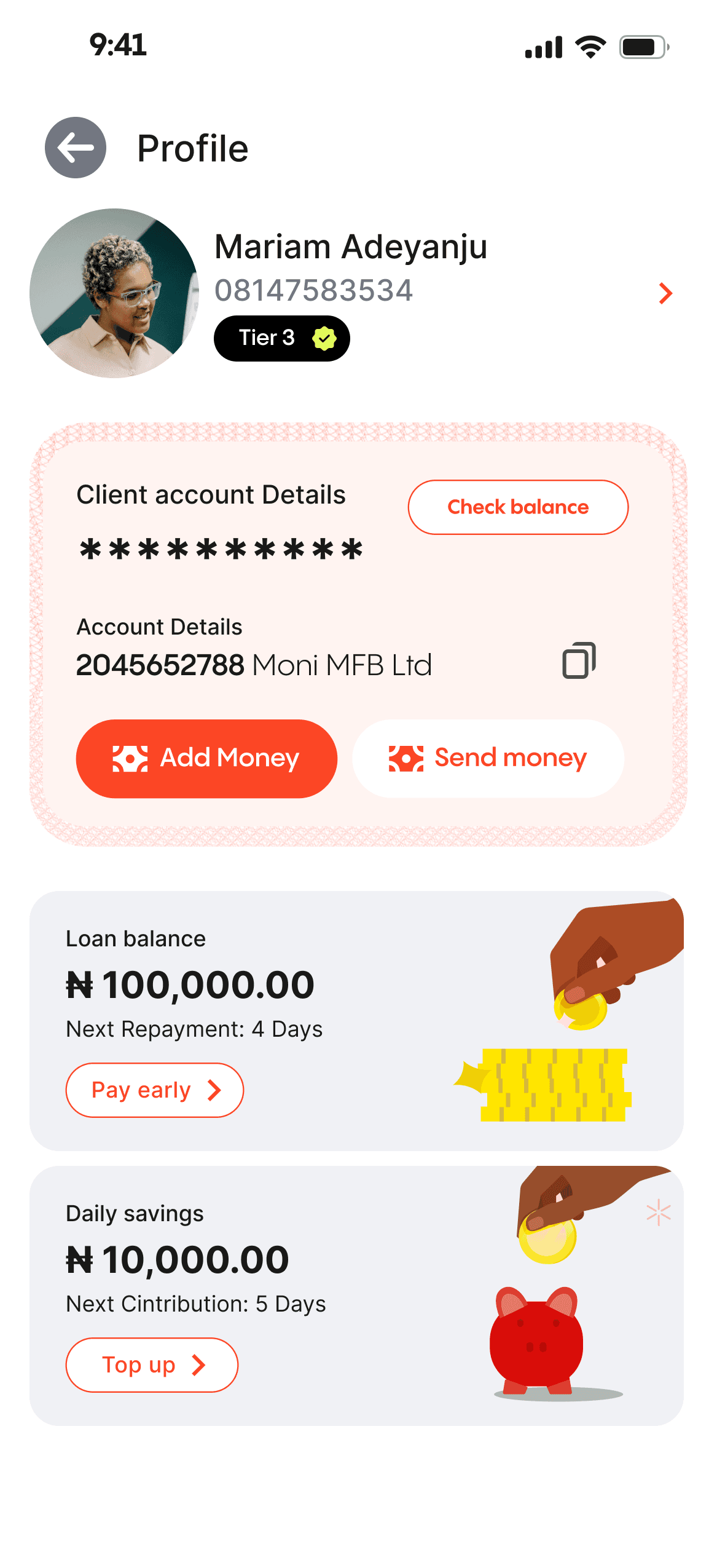
A well-organized dashboard prominently presents vital details and utilizes visual structure to emphasize data priorities. I designed it to enable users to quickly identify crucial insights and effortlessly explore relevant areas.

Improving the interaction
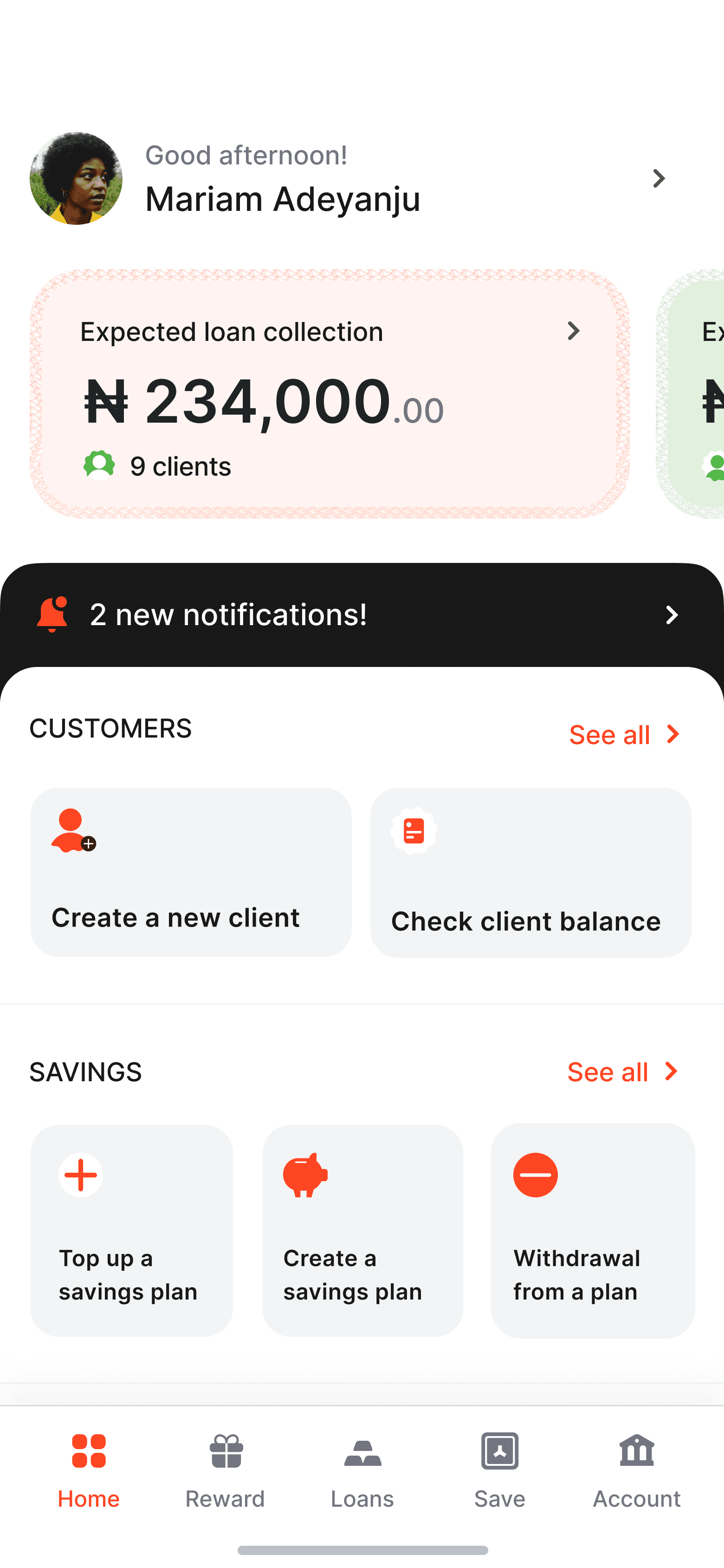
We explored a different approach by combining loans, and savings balances within the dashboard, establishing a consolidated information hub.
A devoted area for day-to-day loans featuring an orange hue for effortless scanning. The savings tab can be reached with a leftward swipe, offering agents all necessary details in one place.
Allocating hues for every segment is crucial in distinguishing and effectively showcasing information to agents.
Adding visual interest
After finalizing the UX, we added a touch of flair to enhance the homepage’s visual appeal. The new visuals effectively highlight key information in accordance with their importance, while also adding visual interest to the page.
After the UX has been figured out, we added a bit of flair to make the homepage more interesting. The new visual, help highlight the key information according to their importance. It also added visual interest to the page.
Key actionS
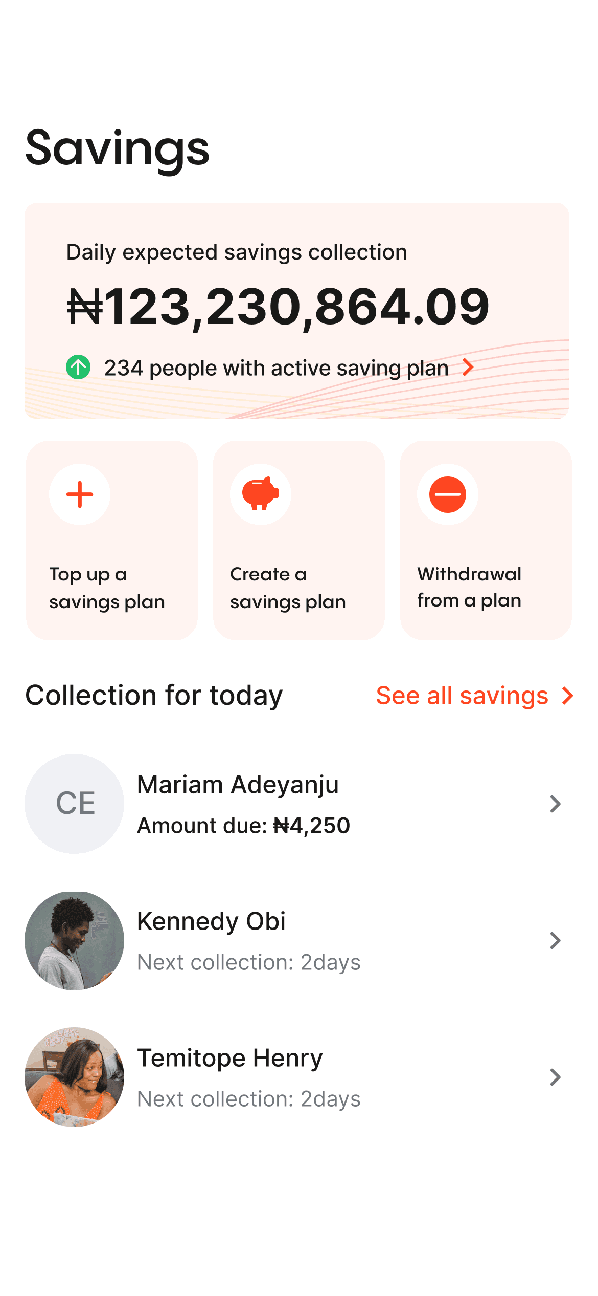
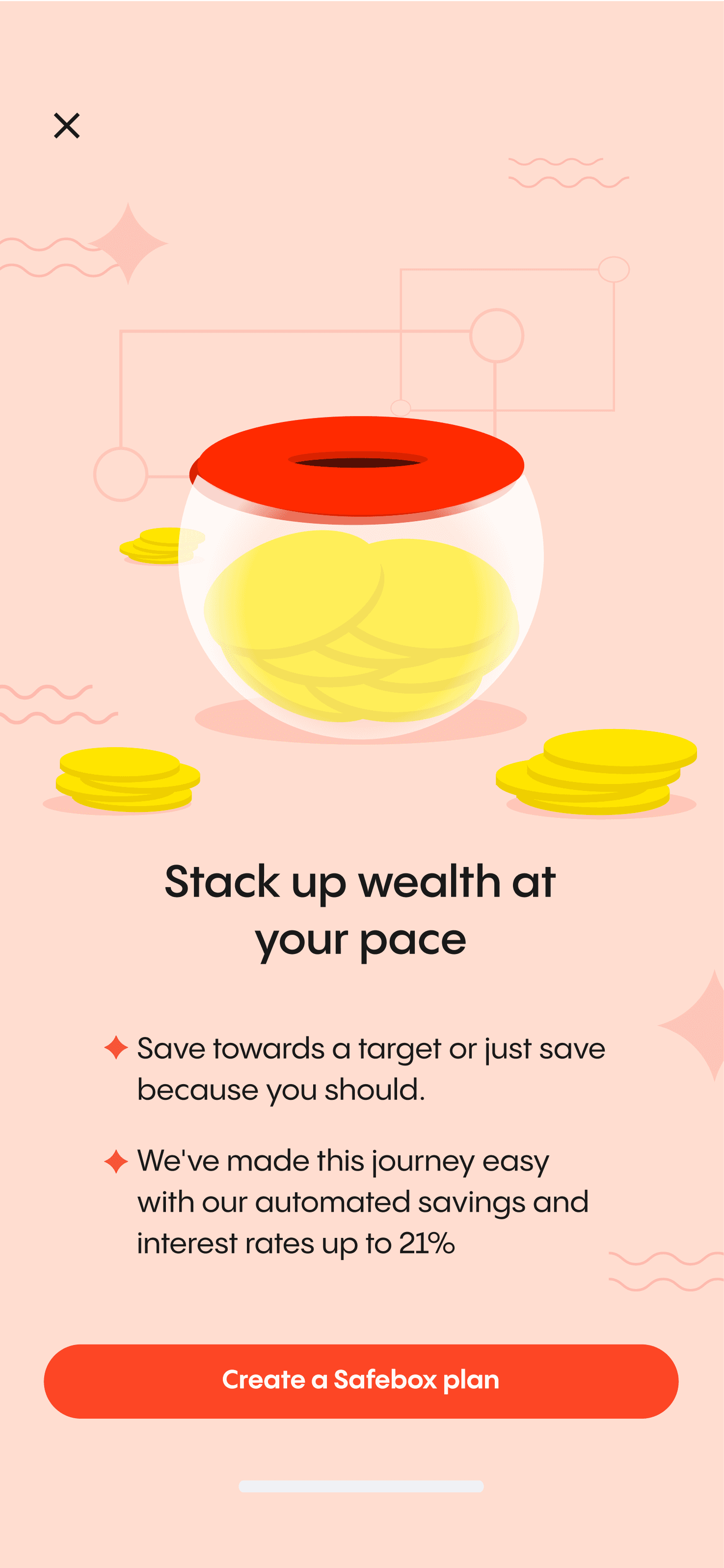
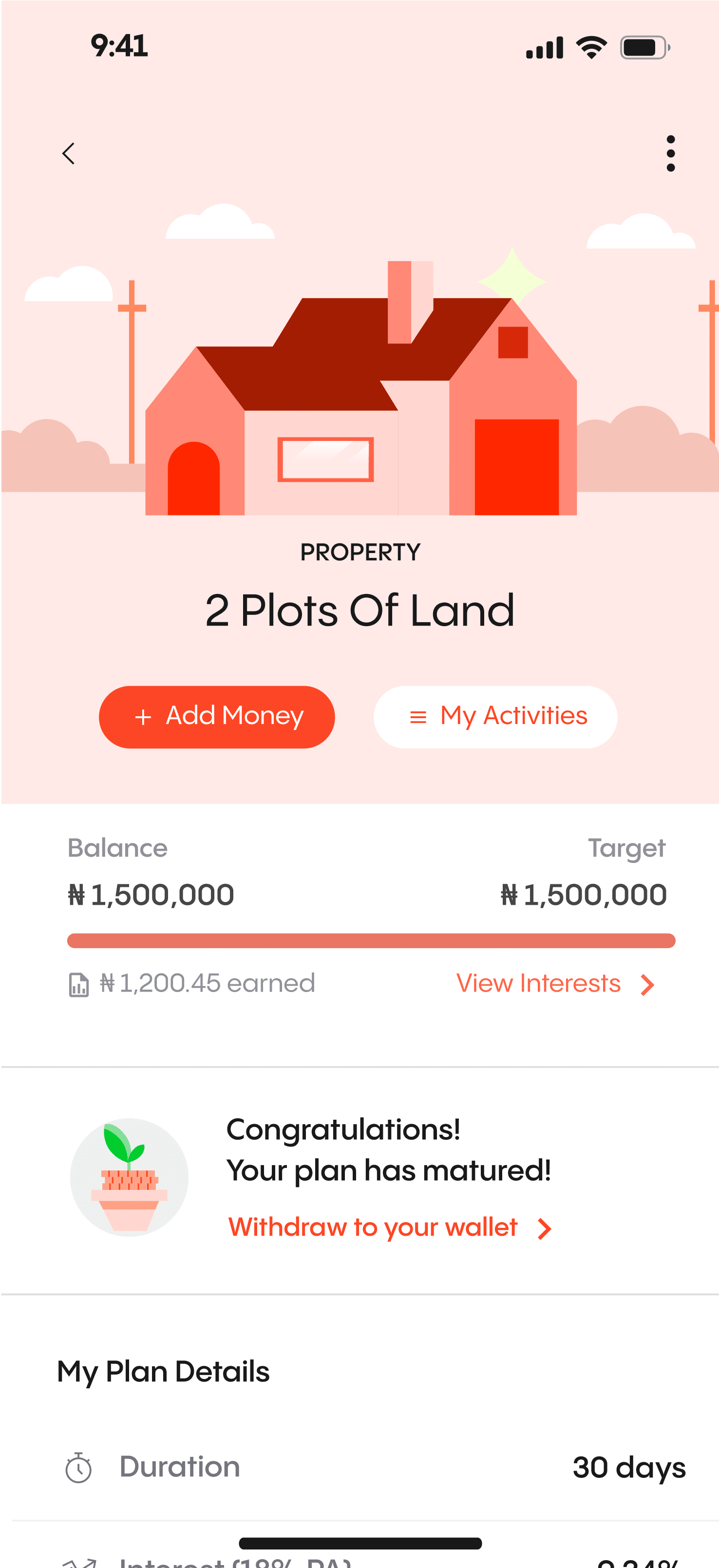
The savings page is designed with a focus on the agent's key actions: creating, topping up, and withdrawing from savings plans. n.
PAGE STRUCTURE
By aligning these elements with the agent's priorities, important details are easily accessible without the need for excessive scrolling, enhancing efficiency and usability.
Adding visual interest
To enhance visual interest, we opted to maintain design consistency and incorporate visual elements from the dashboard and loan section. This approach ensures a cohesive visual language throughout the interface while adding an engaging and captivating touch to the overall design.
PRIORITIZING KEY INFORMATION AND ACTIONS
The card functions as a concise summary for agents, by presenting information in a visually appealing and organized manner. Its modular nature enables flexible arrangement and prioritization of content
incorporating affordances
We integrated physical card usage for collecting savings, providing a tangible and intuitive method to track and manage savings for agents and customers.

AJo card
We replaced conventional input fields with a digital replica of the Ajo (savings) card, leveraging familiar elements for the target users, resulting in enhanced understanding and usability in the digital environment.
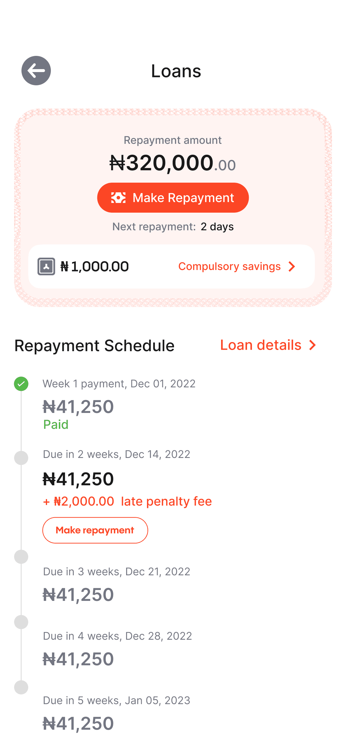
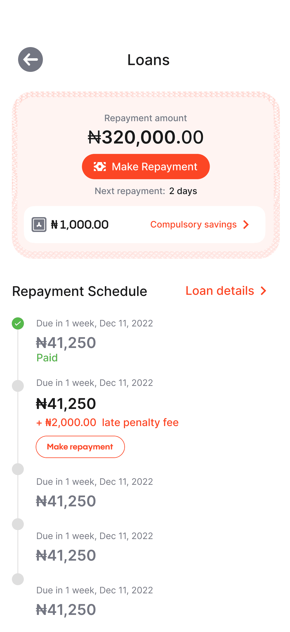
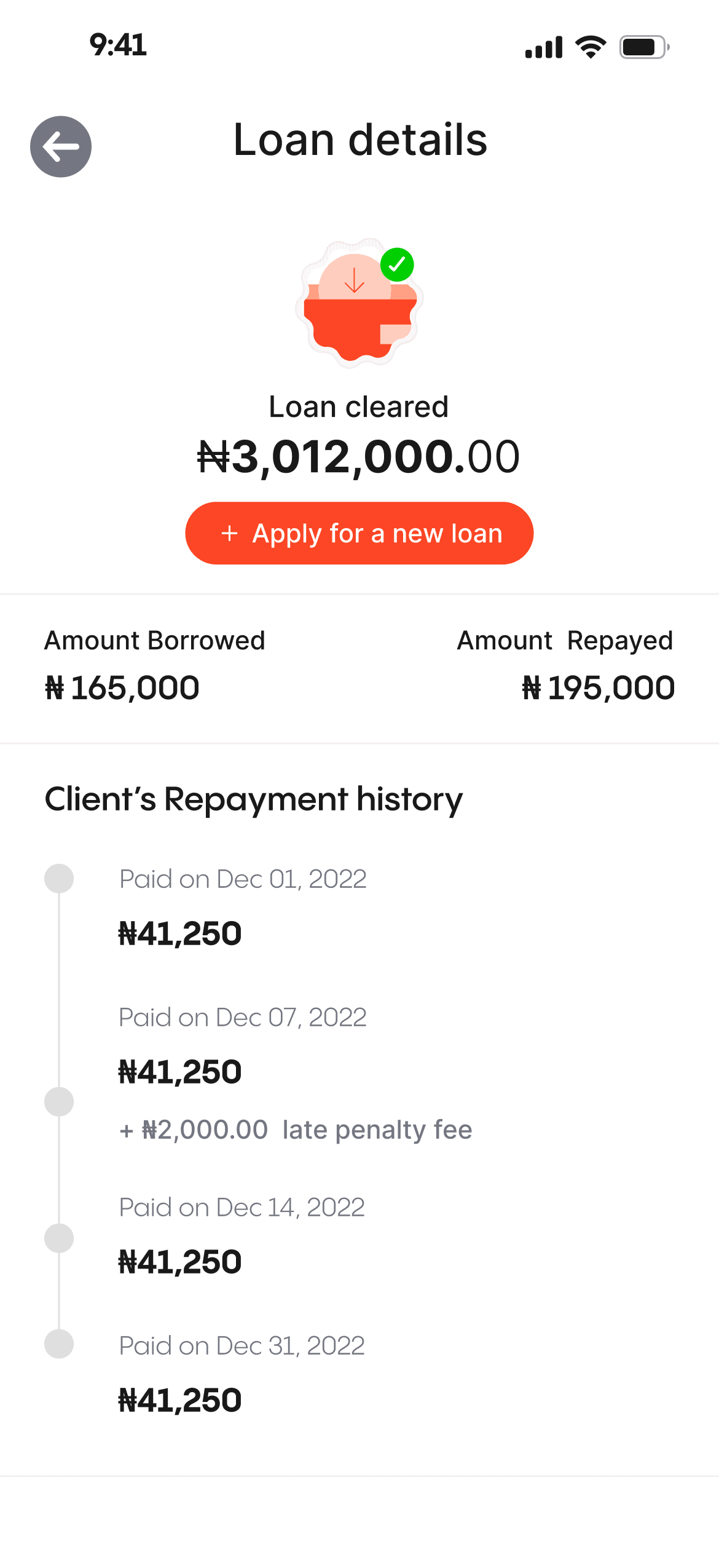
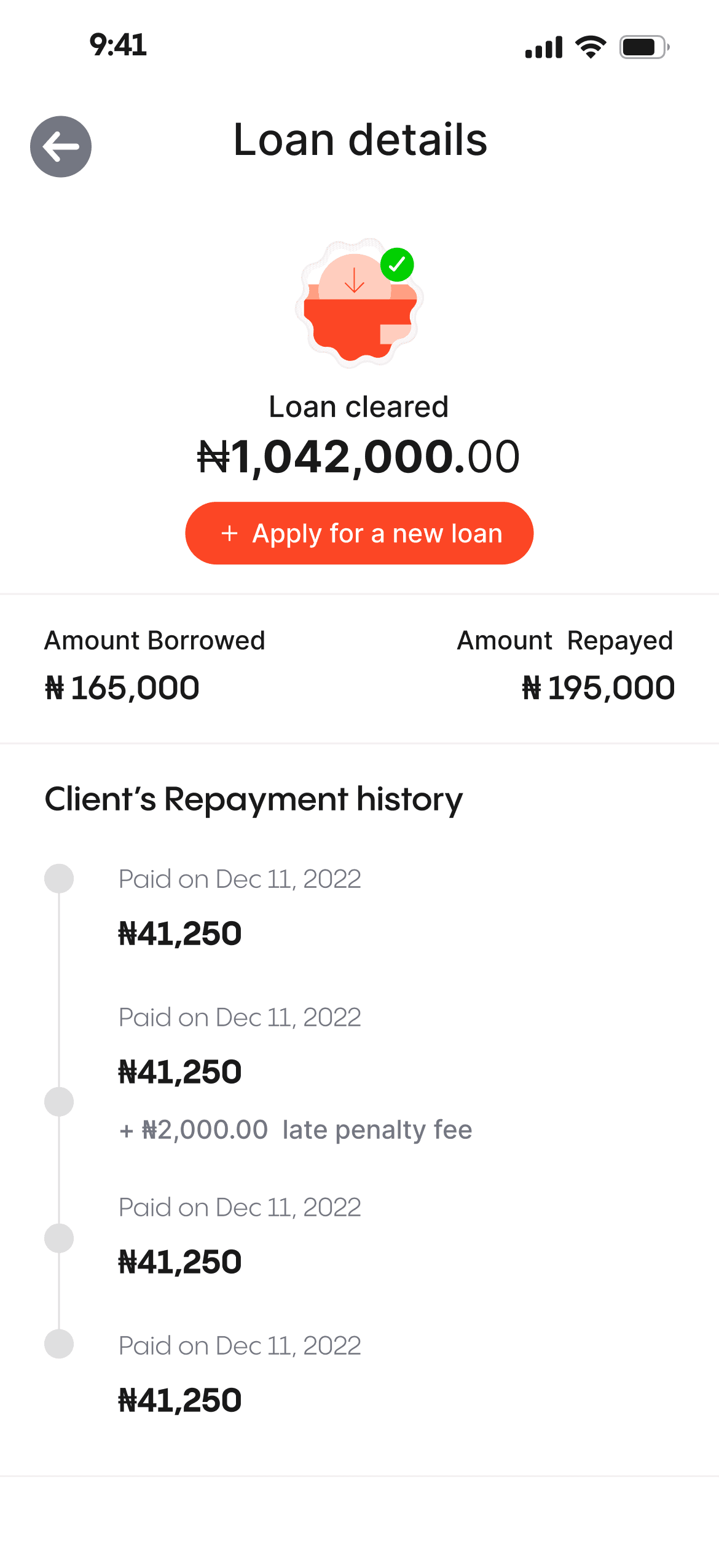
I used a different layering technique for the loans page, to create a transparent hierarchical structure,while minimizing hidden information.
The new layering approach help to showcase the information needed for both the personal and group loan with a tab without the use of another page entirely
information HIERARCHY
Due to loan-specific characteristics, the "View more" option was not used on the platform. Instead, alternative approaches were employed to provide comprehensive loan information without additional navigation.

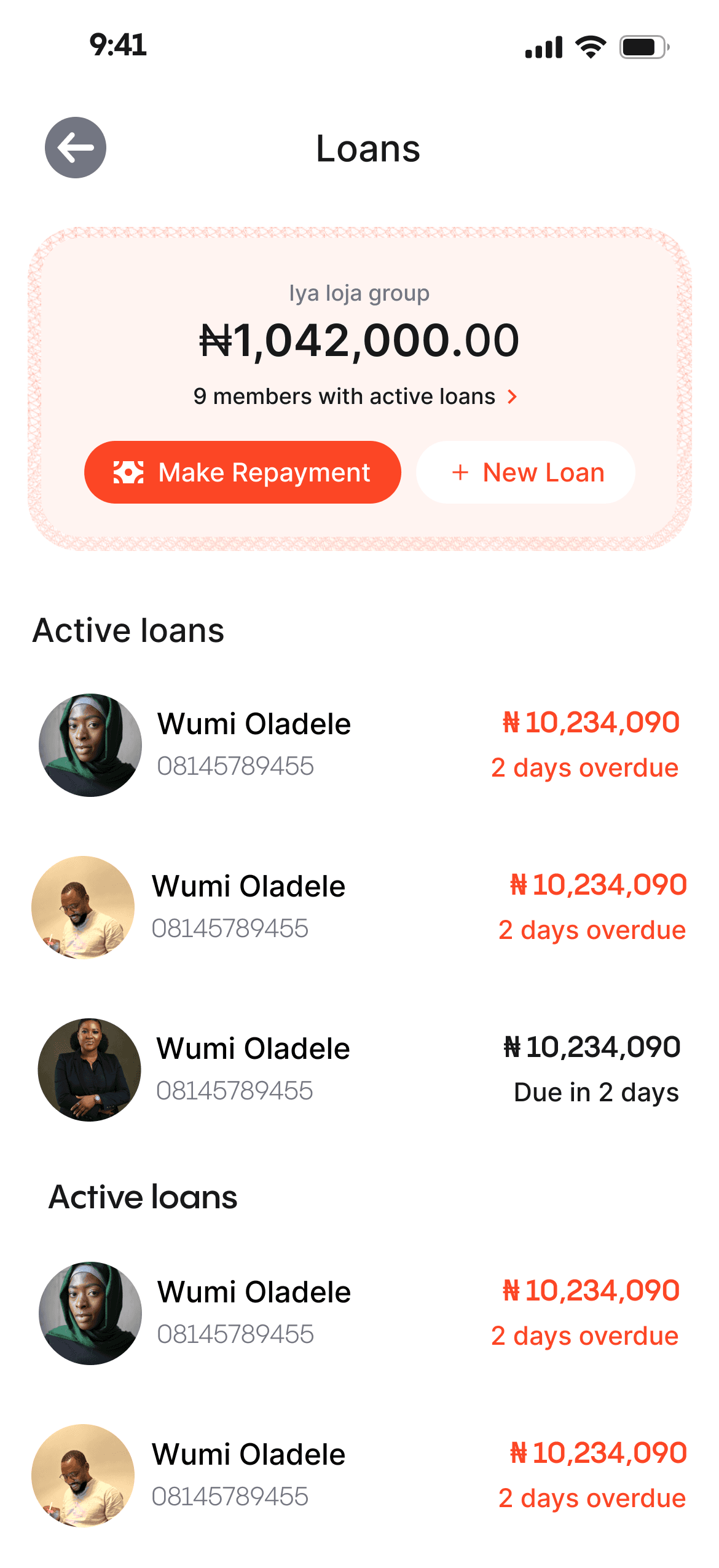
Universal Search
I implemented a search feature on the loans page, allowing users to quickly access individual and group loans through a modal, eliminating the need for page switching, this also serves as an explore page
Adding visual interest
After multiple iterations, I integrated design elements from the dashboard to enhance visual appeal and maintain consistency on the loan page. This not only adds visual interest but also establishes a strong visual balance and hierarchy for an improved user experience.
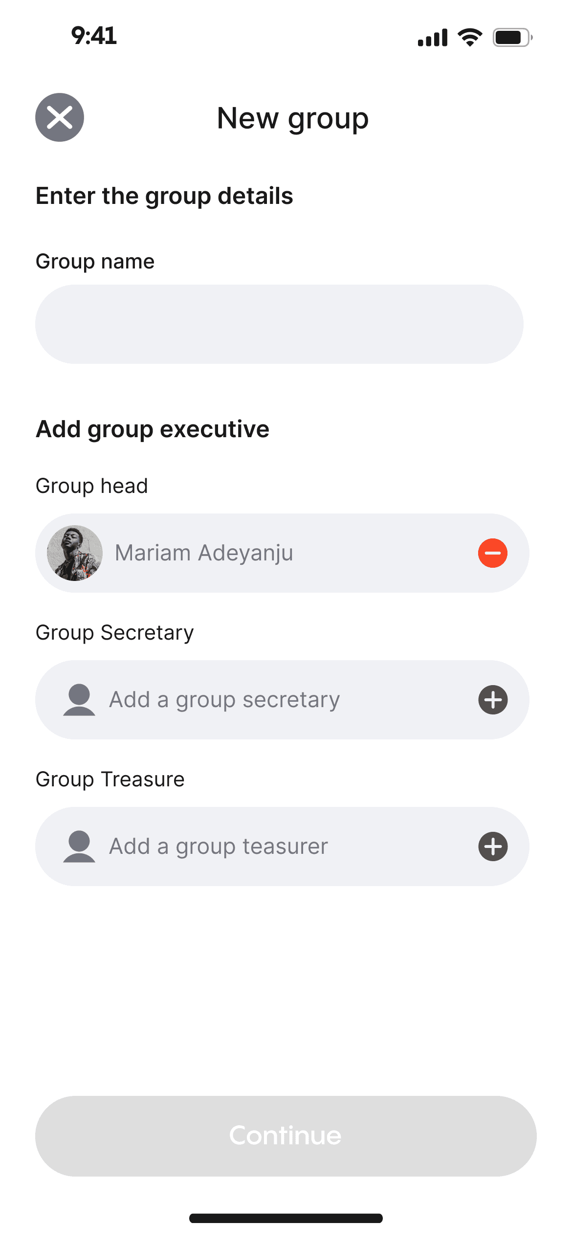
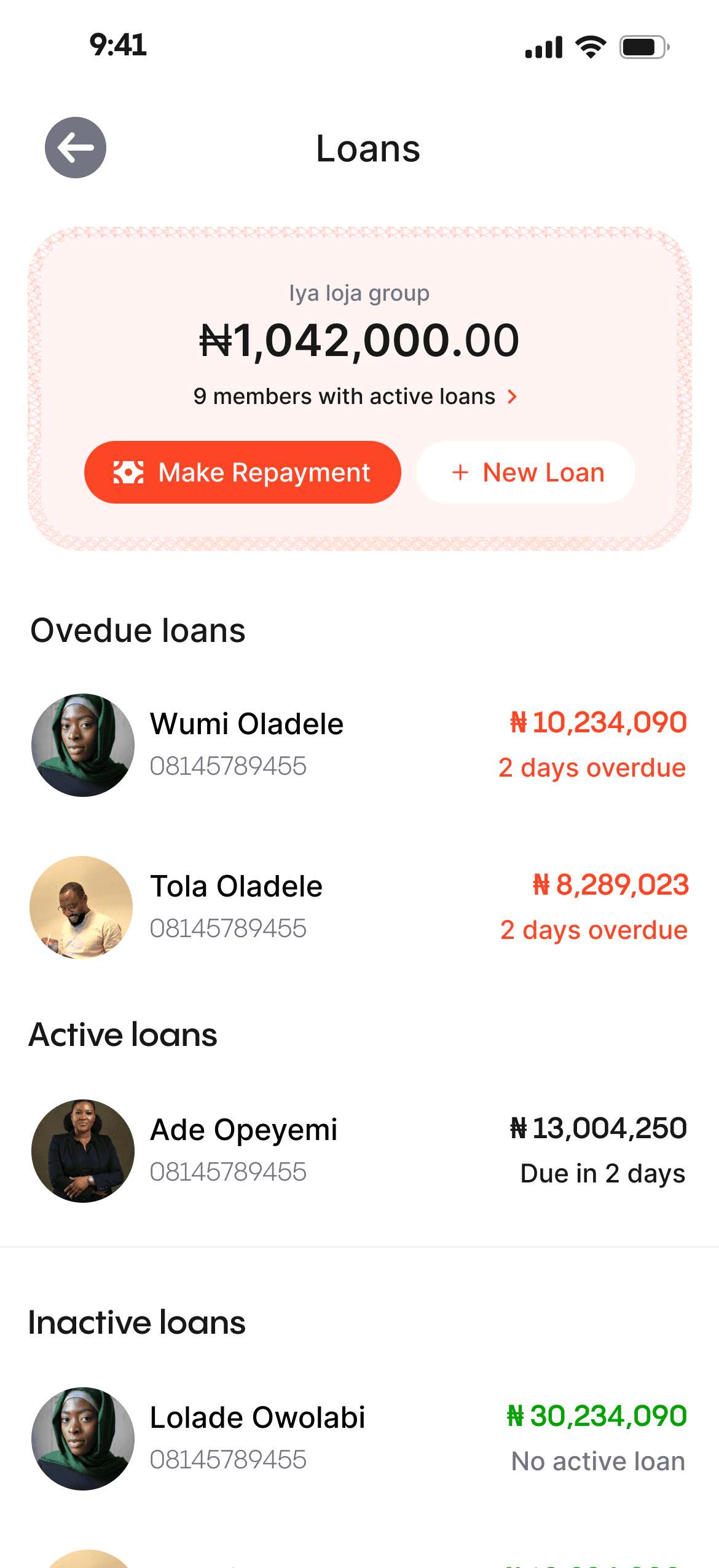
Group loans
Users have the option to create loan groups, allowing them to collectively collect loans with trusted individuals. This group dynamic promotes accountability among members, reducing the risk of default and ensuring a shared responsibility for loan repayment.
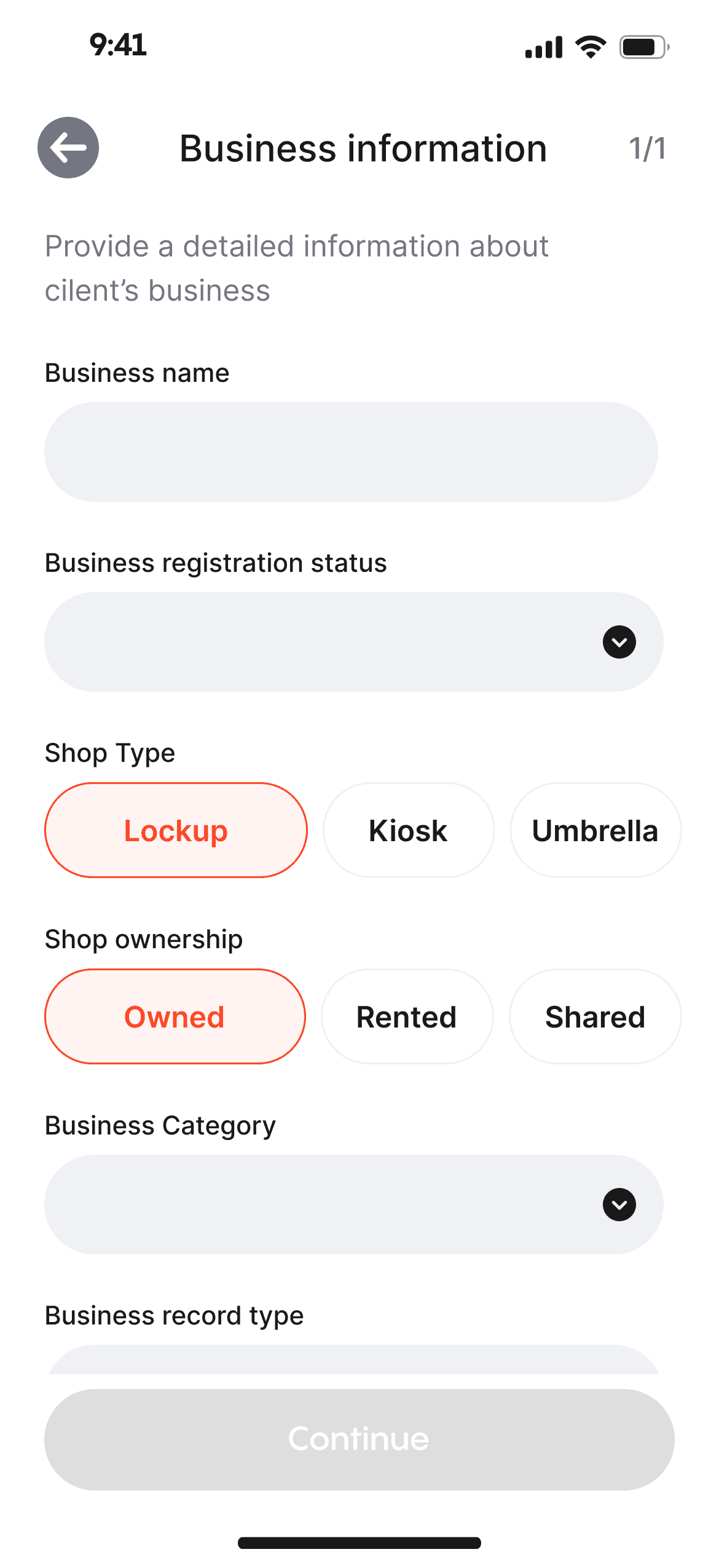
Form input
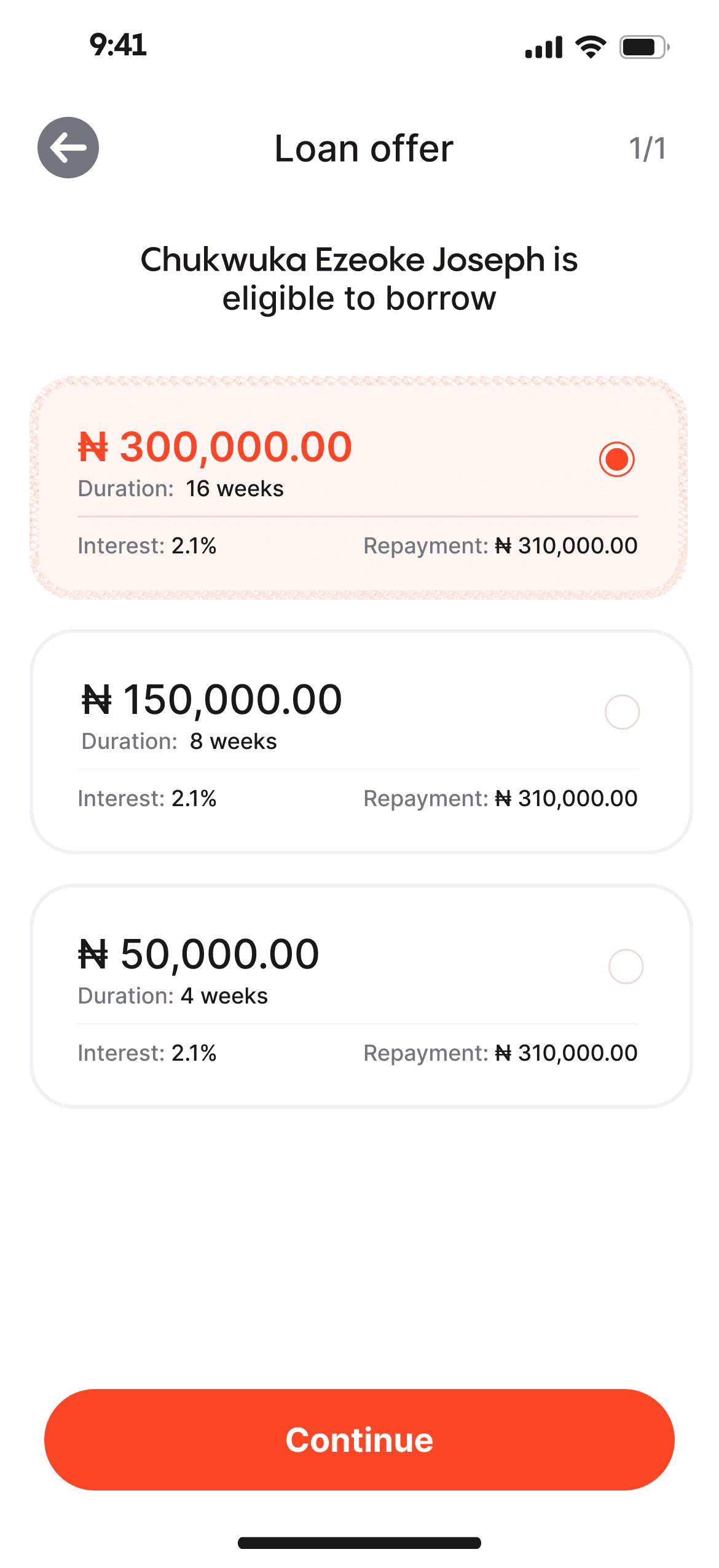
To optimize form-filling speed, I implemented input controls and consolidated shorter fields to expedite the process. Fields with fewer than 7 characters were placed side by side, and options with fewer than 3 characters were directly displayed on the page, eliminating the need for a dropdown menu. This approach aimed to enhance efficiency and minimize user effort in completing the form.
Adding visual interest to form FIELDS
We created a somewhat distinct variant for certain fields that appear solitary on the page, aiming to enhance their appeal and encourage clicks by incorporating shadows on a white backdrop, though the shadows may be excessive when presenting numerous fields
add a Client
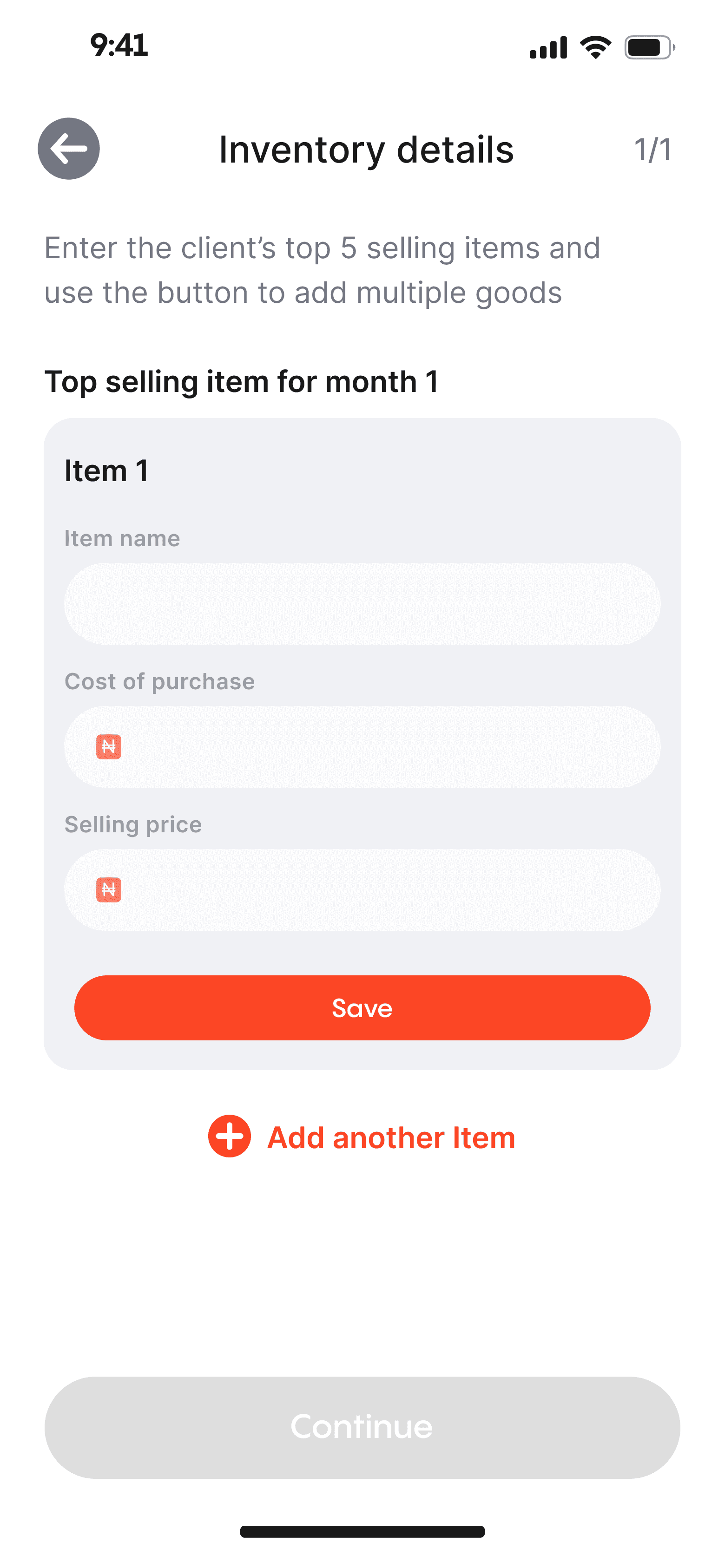
The agents can instantly register a client and set up an account for them, which is accessible immediately, in contrast to traditional banks. All they need is the client's phone number, personal details, and a selfie to get started.
Customer management

Agent can easily manage the customer's account from the profile page
All the possible action that can be taken by the customer can be accessed on the profile page. Having a single source of trust is very helpful to the user experience
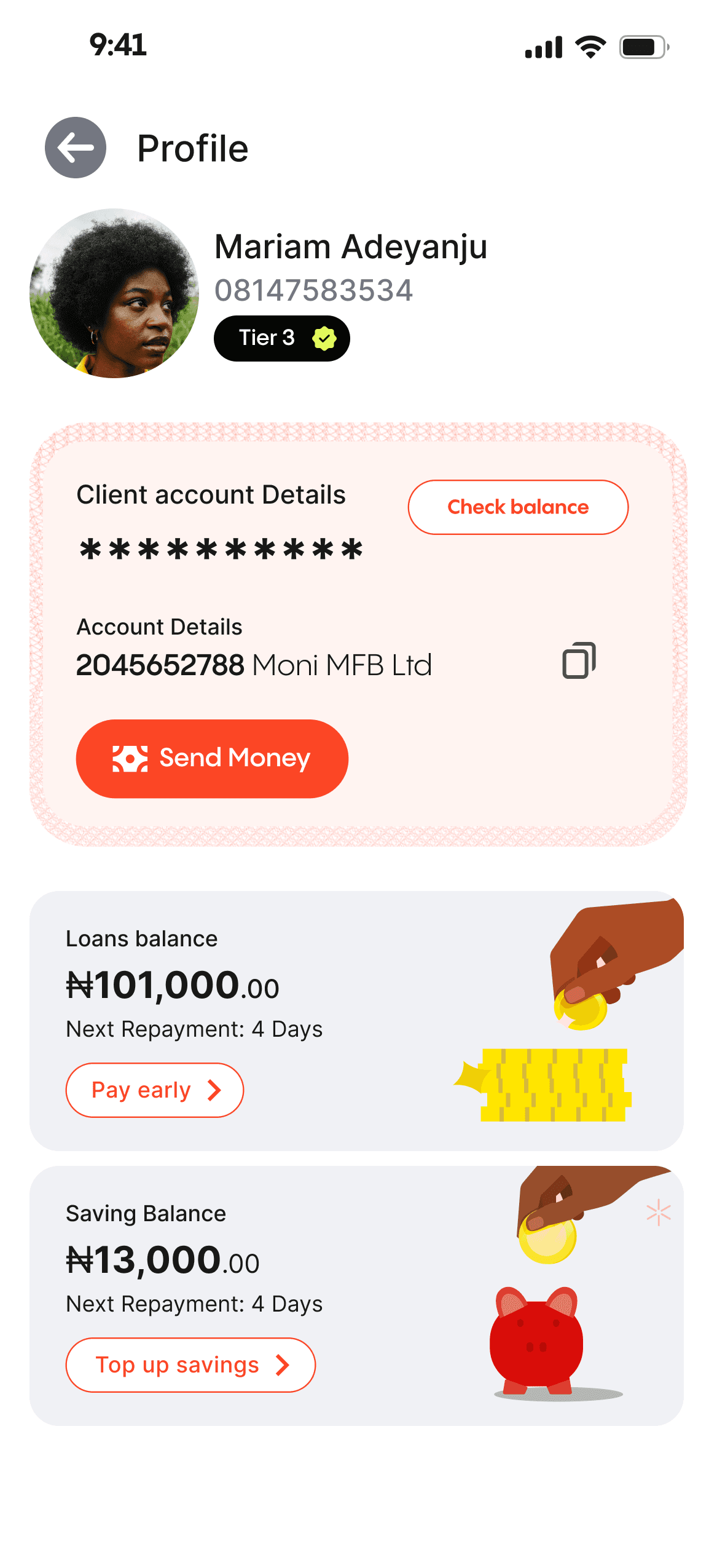

Personal account manager
To empower agents to serve as personal account managers, assisting with everyday financial tasks such as deposits, withdrawals, savings, and loans. Users can easily have access to traditional Ajo savings and a loan service based on community trust and individual loan history.
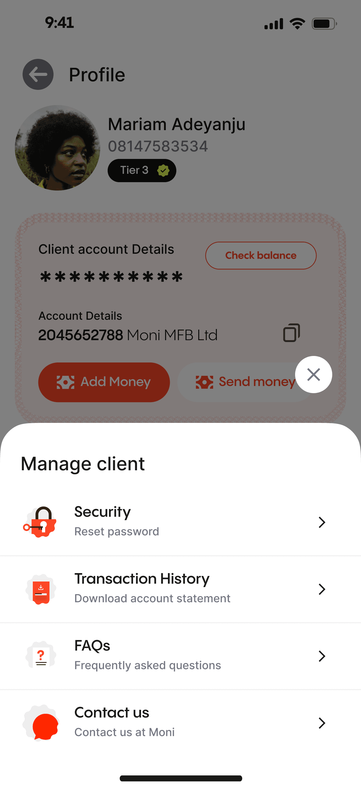
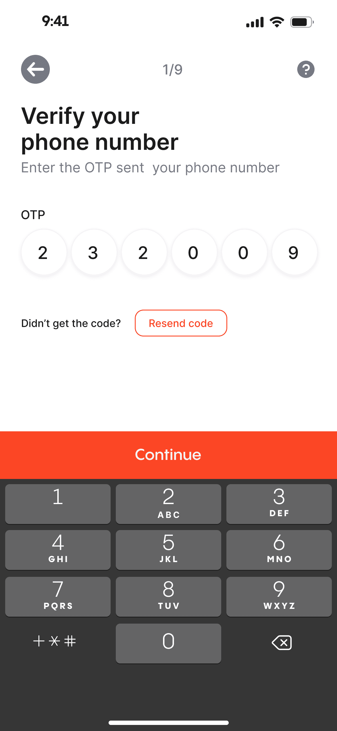
To enhance security and prevent fraud, we utilize SMS and OTP codes for customer account authorization.
Since the customers are not operating this app directly, it is important to safeguard their account and prevent any form of fraud that might be attempted by the agent of the agent's staff.
OTP authentication
The agents cannot execute any type of action on the user's account without permission from the user. This permission is commonly delivered via SMS

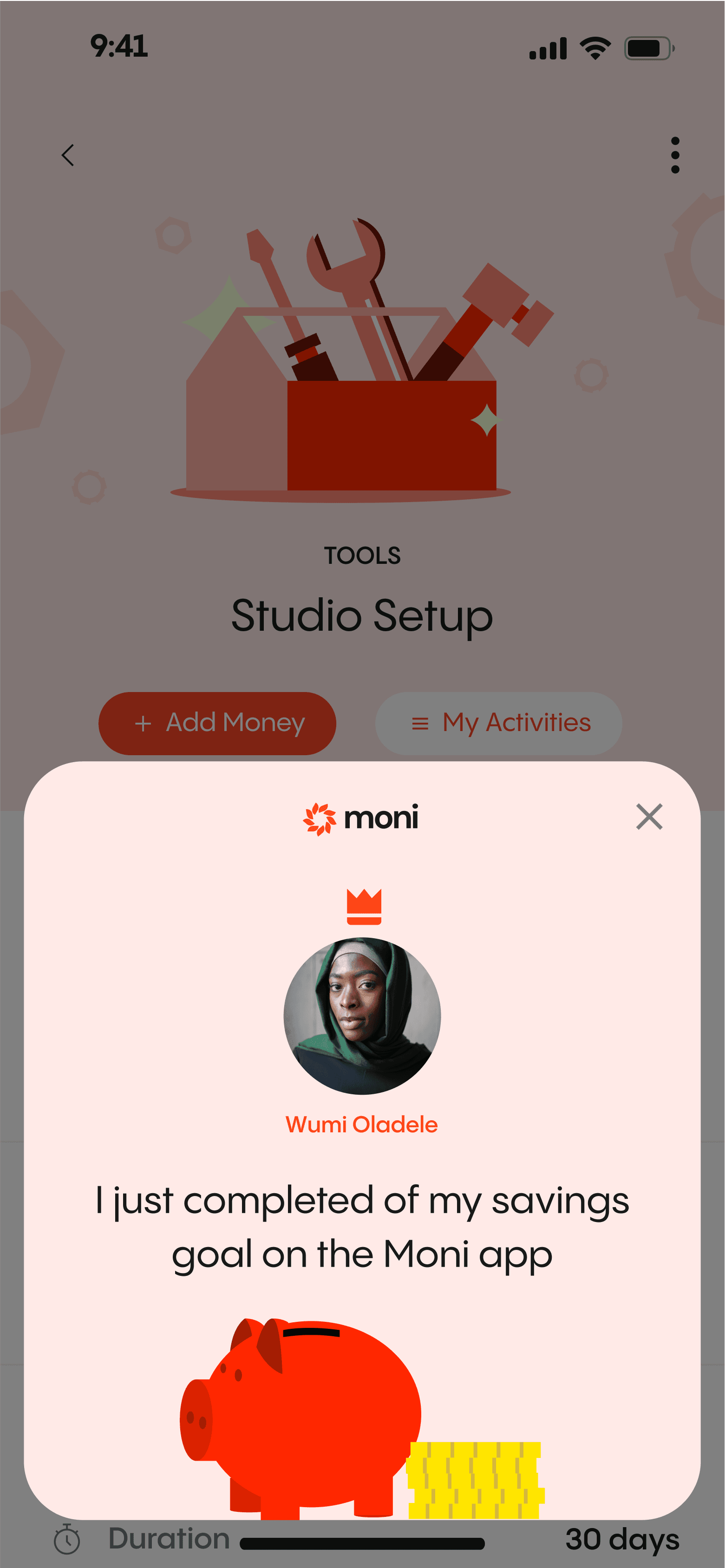
Moni Reward
Agents can earn rewards as to provide financial services at the grassroots level, this is to keep them motivated as they help bank the unbanked.
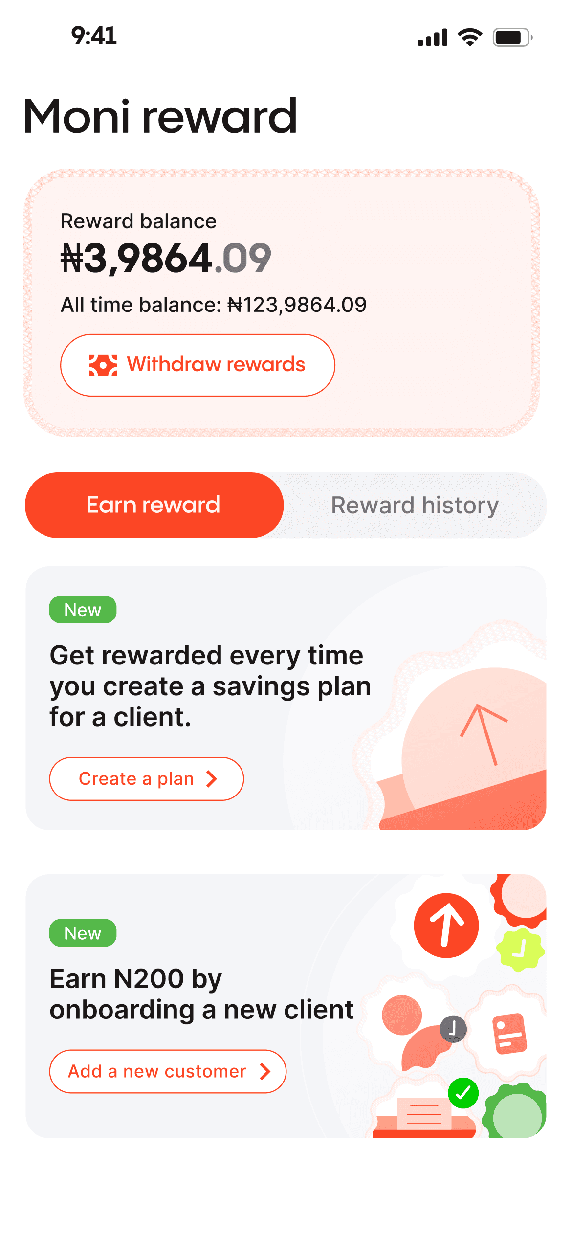
We incentivized some of the key actions on the app to reward as they provide fiancial service to people.
During my extensive exploration, I serendipitously stumbled upon a treasure trove of remarkable design styles that ingeniously incorporated the utilization of jagged circles. These captivating visual elements, meticulously integrated into Moni's interface, bestow upon the app a truly distinctive look and feel that is incomparably unique to its brand identity.
By weaving the sharp edges and
organic curves of jagged circles
helps to achieve a harmonious balance between dynamism and elegance.

By promoting economic inclusion, fostering financial literacy, ensuring security, and rewarding agents, our project aims to create a more inclusive financial ecosystem that benefits all stakeholders.

Financial Inclusion
The app bridges the gap between the unbanked population and formal financial services, allowing them to manage their accounts, save, and access loans.

Rewarding Agents
This motivates them to continue serving their communities, creating a win-win situation.

Customized finance
This enables agents to offer individualized financial guidance & bespoke assistance to individuals

Empowering Agents
Agents can provide vital financial services to their communities. This not only generates income for agents but also positions them as trusted financial advisors


LET'S MAKE MAGIC HAPPEN!
Get in touch and let's create something amazing together!
I was part of the ambitious team at Moni to provide financial services to excluded demography in Nigeria. I spearheaded wireframing, high-fidelity design, and overall user experience from end to end.
I was part of the ambitious team at Moni to provide financial services to excluded demography in Nigeria. I spearheaded wireframing, high-fidelity design, and overall user experience from end to end.
Despite efforts in Nigeria's fintech space, many Nigerians still lack basic financial services. To address this issue, I designed an end-to-end user experience that leverages existing infrastructures to provide financial services to underserved communities.
Team
The team comprised two product managers focused on the business aspect, a storytelling copywriter who make sure the app communicated properly to the target audience, and a design manager who managed the entire project.
Skills
During the project, I utilized various abilities such as competitive analysis, wireframing, user testing, UI design, and prototype creation.
Access to financial services in Nigeria is highly unequal, with high net-worth individuals enjoying tailored financial management while a significant portion of the population remains unbanked. To address this problem, leveraging the existing agency system, similar to POS operators, is crucial. These agents will act as intermediaries, offering vital financial services and serving as account managers for the unbanked.
The problem
41%
of Nigerians are unbanked with ₦26.17 trillion outside the banking system. 4 out of 10 people are unbanked (44% of the population).
The solution
Leveraging the existing agency framework & maximizing the agents’ penetration and understanding of their communities.
After examining other agency applications in the finance space, I discovered common design patterns. These include unified dashboards, transaction history, quick actions, client management, notifications, secure authentication, offline mode, help and support, analytics, and multilingual support.
Designing for efficiency, and accuracy while minimizing errors.
Implementing robust security measures to instil user confidence.
Designing intuitive and streamlined workflows to ensure a seamless user experience.
information HIERARCHY
I identified the key actions that agents need to take and optimized the interface to prioritize these actions.
Page STRUCTURE
A well-organized dashboard prominently presents vital details and utilizes visual structure to emphasize data priorities. I designed it to enable users to quickly identify crucial insights and effortlessly explore relevant areas.
Improving the interaction
We explored a different approach by combining loans, and savings balances within the dashboard, establishing a consolidated information hub.
A devoted area for day-to-day loans featuring an orange hue for effortless scanning. The savings tab can be reached with a leftward swipe, offering agents all necessary details in one place.
Allocating hues for every segment is crucial in distinguishing and effectively showcasing information to agents.
Adding visual interest
After finalizing the UX, we added a touch of flair to enhance the homepage’s visual appeal. The new visuals effectively highlight key information in accordance with their importance, while also adding visual interest to the page.
After the UX has been figured out, we added a bit of flair to make the homepage more interesting. The new visual, help highlight the key information according to their importance. It also added visual interest to the page.
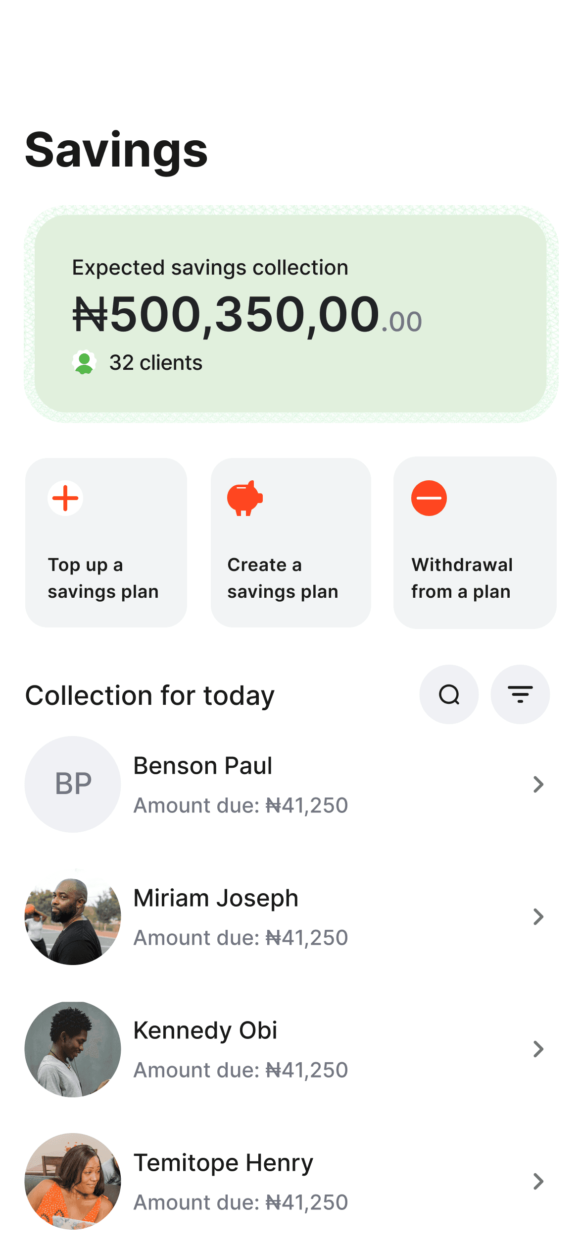
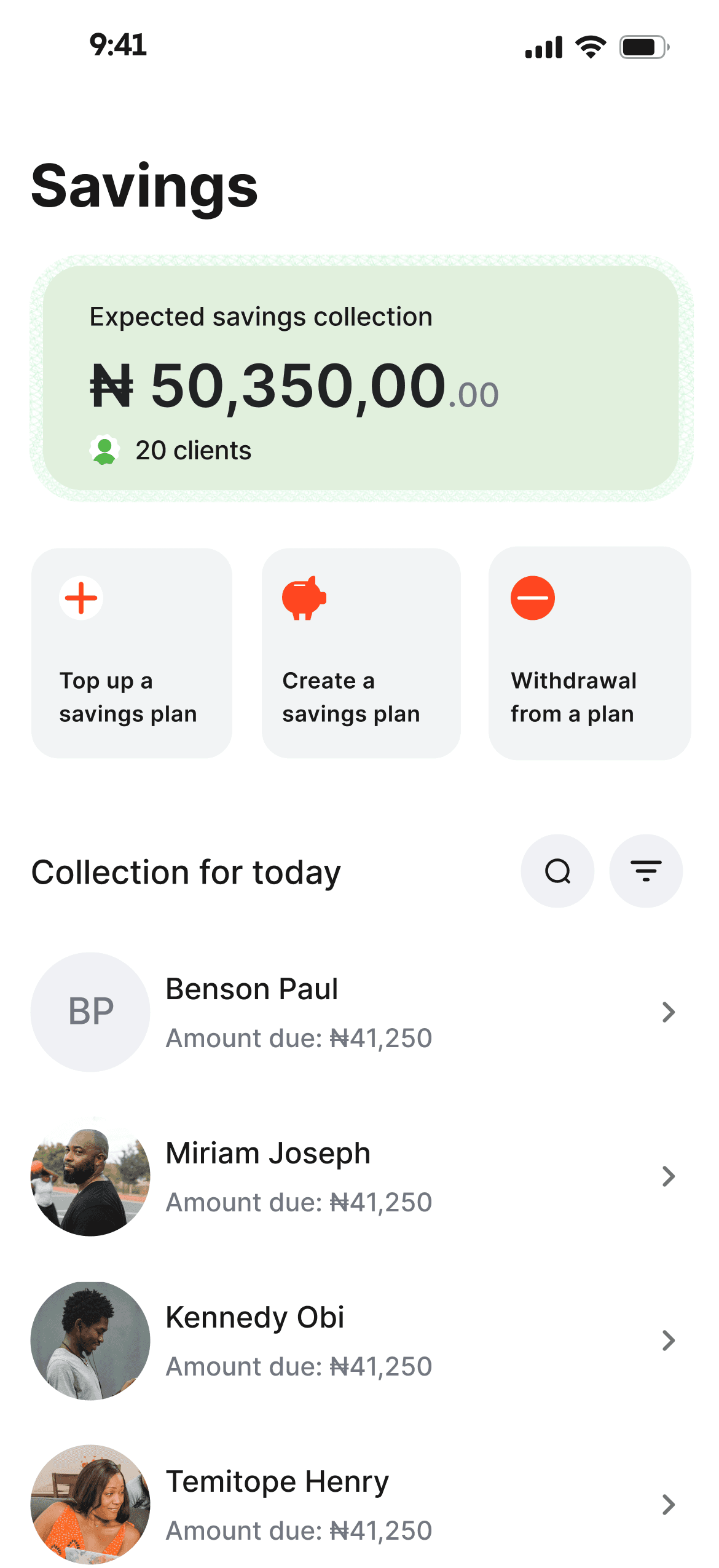
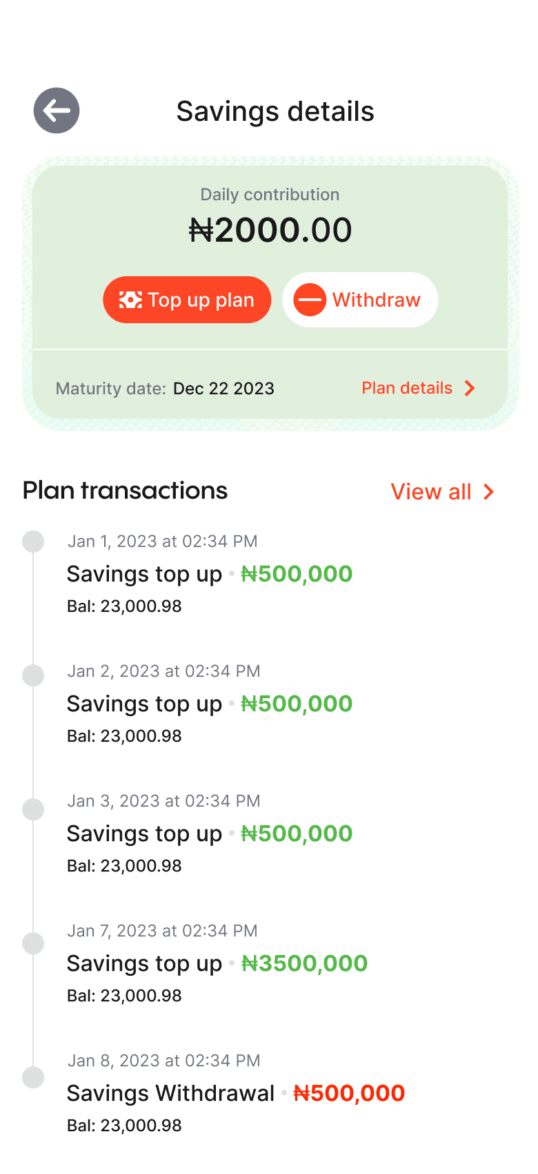
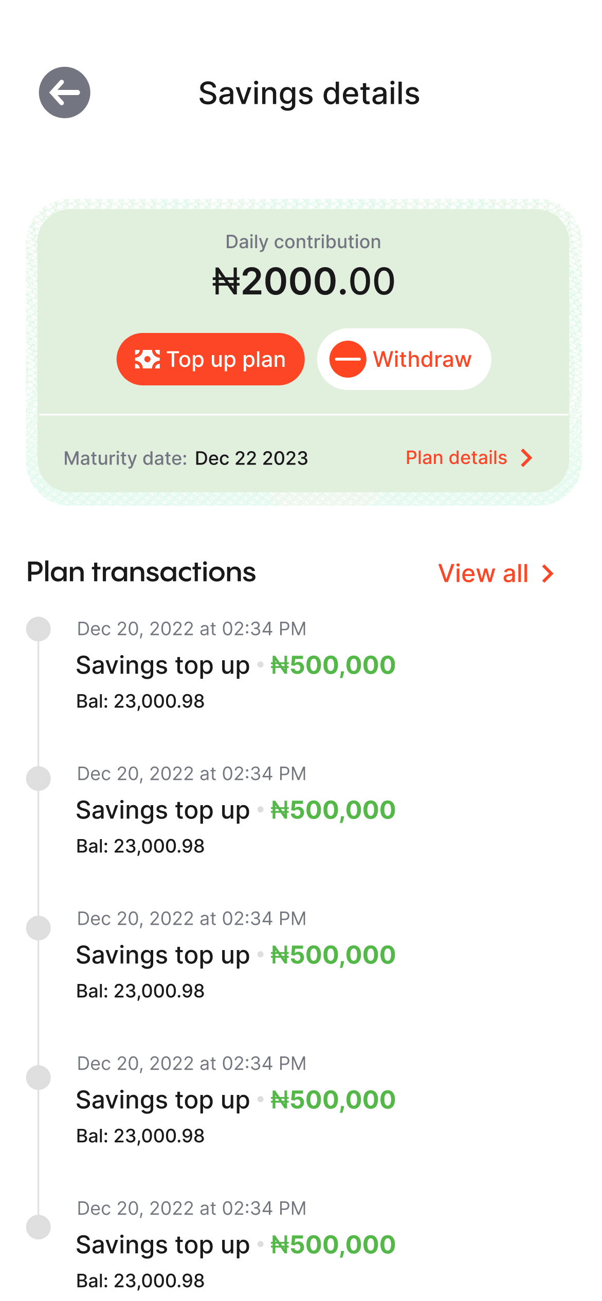
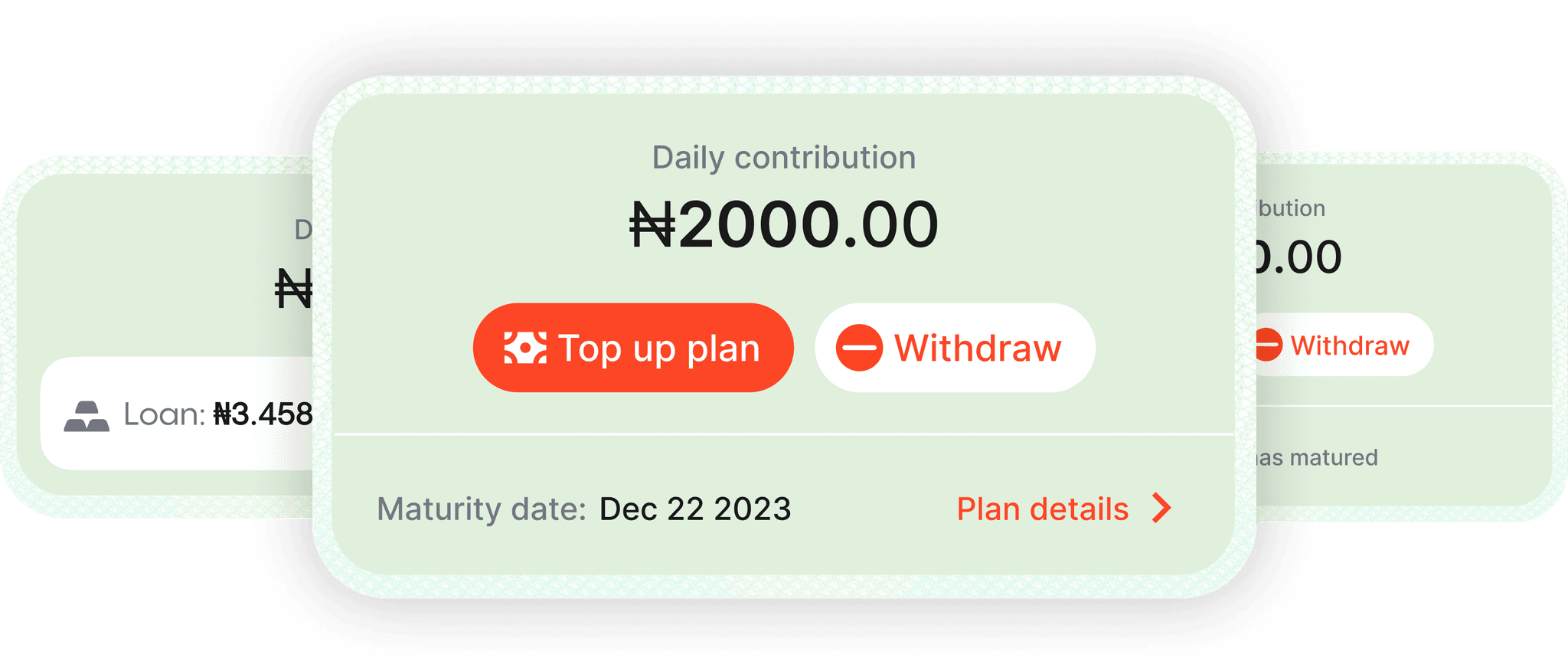
Key actionS
The savings page is designed with a focus on the agent's key actions: creating, topping up, and withdrawing from savings plans.
PAGE STRUCTURE
By aligning these elements with the agent's priorities, important details are easily accessible without the need for excessive scrolling, enhancing efficiency and usability.
Adding visual interest
To enhance visual interest, we opted to maintain design consistency and incorporate visual elements from the dashboard and loan section. This approach ensures a cohesive visual language throughout the interface while adding an engaging and captivating touch to the overall design.
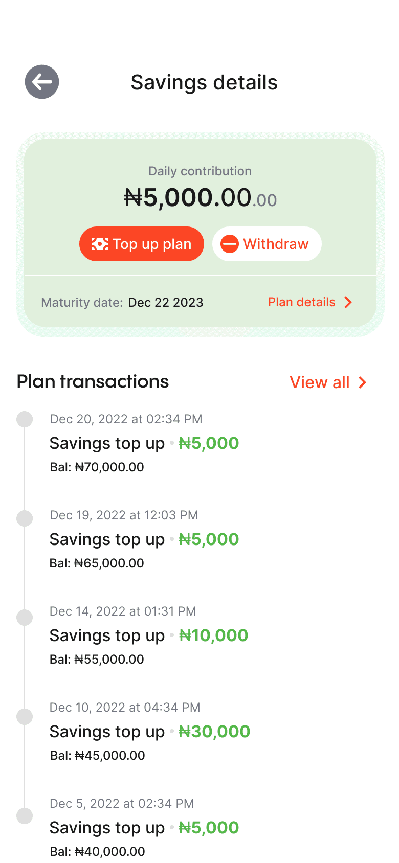
PRIORITIZING KEY INFORMATION AND ACTIONS
The card functions as a concise summary for agents, by presenting information in a visually appealing and organized manner. Its modular nature enables flexible arrangement and prioritization of content
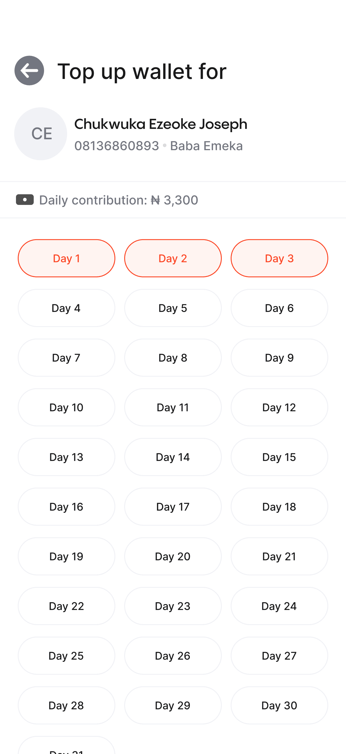
affordances
We integrated physical card usage for collecting savings, providing a tangible and intuitive method to track and manage savings for agents and customers.
AJo card
We replaced conventional input fields with a digital replica of the Ajo (savings) card, leveraging familiar elements for the target users, resulting in enhanced understanding and usability in the digital environment.
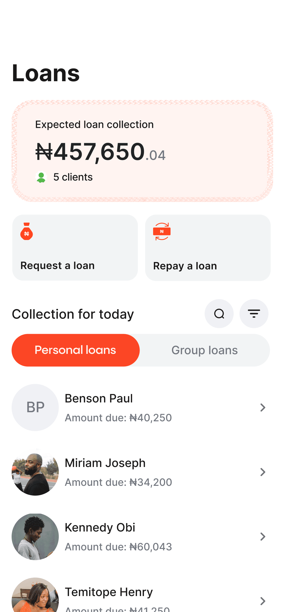
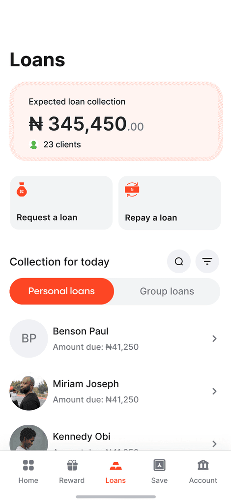
I used a different layering technique for the loans page, to create a transparent hierarchical structure,while minimizing hidden information.
The new layering approach help to showcase the information needed for both the personal and group loan with a tab without the use of another page entirely
information HIERARCHY
Due to loan-specific characteristics, the "View more" option was not used on the platform. Instead, alternative approaches were employed to provide comprehensive loan information without additional navigation.
Universal Search
I implemented a search feature on the loans page, allowing users to quickly access individual and group loans through a modal, eliminating the need for page switching, this also serves as an explore page
Adding visual interest
After multiple iterations, I integrated design elements from the dashboard to enhance visual appeal and maintain consistency on the loan page. This not only adds visual interest but also establishes a strong visual balance and hierarchy for an improved user experience.
Group loans
Users have the option to create loan groups, allowing them to collectively collect loans with trusted individuals. This group dynamic promotes accountability among members, reducing the risk of default and ensuring a shared responsibility for loan repayment.
Form input
To optimize form-filling speed, I implemented input controls and consolidated shorter fields to expedite the process. Fields with fewer than 7 characters were placed side by side, and options with fewer than 3 characters were directly displayed on the page, eliminating the need for a dropdown menu. This approach aimed to enhance efficiency and minimize user effort in completing the form.
Adding visual interest to form FIELDS
We created a somewhat distinct variant for certain fields that appear solitary on the page, aiming to enhance their appeal and encourage clicks by incorporating shadows on a white backdrop, though the shadows may be excessive when presenting numerous fields
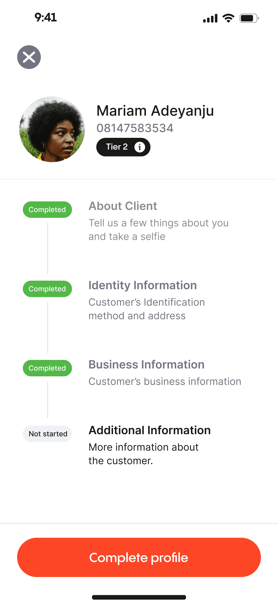
add a Client
The agents can instantly register a client and set up an account for them, which is accessible immediately, in contrast to traditional banks. All they need is the client's phone number, personal details, and a selfie to get started.
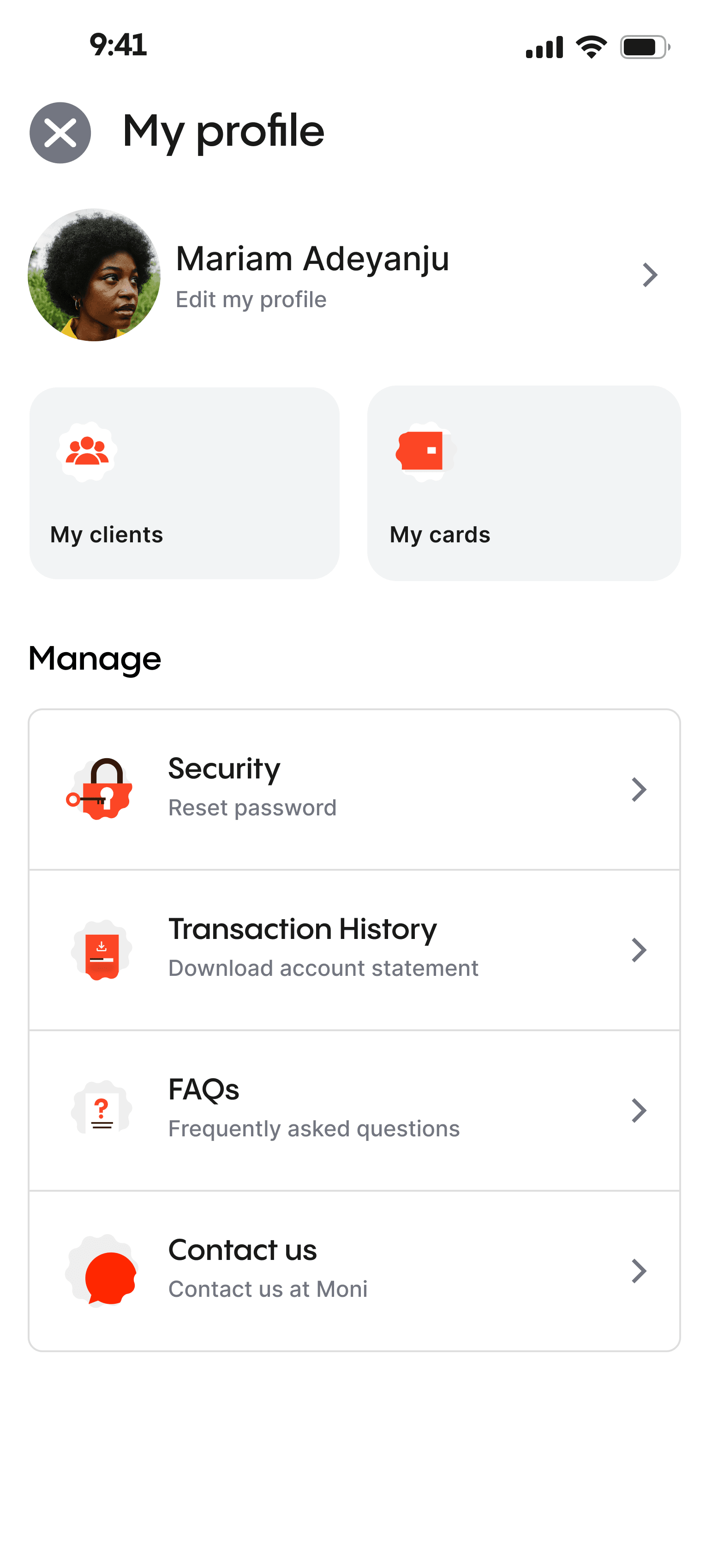
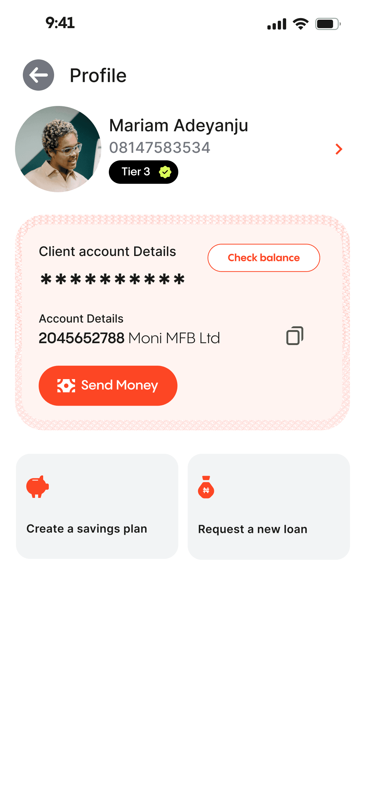
Customer management
Agent can easily manage the customer's account from the profile page
All the possible action that can be taken by the customer can be accessed on the profile page. Having a single source of trust is very helpful to the user experience

Personal account manager
To empower agents to serve as personal account managers, assisting with everyday financial tasks such as deposits, withdrawals, savings, and loans. Users can easily have access to traditional Ajo savings and a loan service based on community trust and individual loan history.
To enhance security and prevent fraud, we utilize SMS and OTP codes for customer account authorization.
Since the customers are not operating this app directly, it is important to safeguard their account and prevent any form of fraud that might be attempted by the agent of the agent's staff.
OTP authentication
The agents cannot execute any type of action on the user's account without permission from the user. This permission is commonly delivered via SMS
Moni Reward
Agents can earn rewards as to provide financial services at the grassroots level, this is to keep them motivated as they help bank the unbanked.
We incentivized some of the key actions on the app to reward as they provide fiancial service to people.
During my extensive exploration, I serendipitously stumbled upon a treasure trove of remarkable design styles that ingeniously incorporated the utilization of jagged circles. These captivating visual elements, meticulously integrated into Moni's interface, bestow upon the app a truly distinctive look and feel that is incomparably unique to its brand identity.
By weaving the sharp edges and
organic curves of jagged circles
helps to achieve a harmonious balance between dynamism and elegance.
By promoting economic inclusion, fostering financial literacy, ensuring security, and rewarding agents, our project aims to create a more inclusive financial ecosystem that benefits all stakeholders.
Financial Inclusion
The app bridges the gap between the unbanked population and formal financial services, allowing them to manage their accounts, save, and access loans.
Rewarding Agents
This motivates them to continue serving their communities, creating a win-win situation.
Customized finance
This enables agents to offer individualized financial guidance & bespoke assistance to individuals
Empowering Agents
Agents can provide vital financial services to their communities. This not only generates income for agents but also positions them as trusted financial advisors
LET'S MAKE MAGIC HAPPEN!
Get in touch and let's create something amazing together!
I was part of the ambitious team at Moni to provide financial services to excluded demography in Nigeria. I spearheaded wireframing, high-fidelity design, and overall user experience from end to end.
I was part of the ambitious team at Moni to provide financial services to excluded demography in Nigeria. I spearheaded wireframing, high-fidelity design, and overall user experience from end to end.
Despite efforts in Nigeria's fintech space, many Nigerians still lack basic financial services. To address this issue, I designed an end-to-end user experience that leverages existing infrastructures to provide financial services to underserved communities.
Team
The team comprised two product managers focused on the business aspect, a storytelling copywriter who make sure the app communicated properly to the target audience, and a design manager who managed the entire project.
Skills
During the project, I utilized various abilities such as competitive analysis, wireframing, user testing, UI design, and prototype creation.
Access to financial services in Nigeria is highly unequal, with high net-worth individuals enjoying tailored financial management, while a significant portion of the population remains unbanked. To address this problem, leveraging the existing agency system, similar to POS operators is crucial. These agents will act as intermediaries offering vital financial services and serving as account managers for the unbanked.
The problem
41%
of Nigerians are unbanked with ₦26.17 trillion outside the banking system. 4 out of 10 people are unbanked
The solution
Leveraging the existing agency framework & maximizing the agents’ penetration and understanding of their communities.
After examining other agency applications in the finance space, I discovered common design patterns. These include unified dashboards, transaction history, quick actions, client management, notifications, secure authentication, offline mode, help and support, analytics, and multilingual support.
Designing for efficiency, and accuracy while minimizing errors.
Implementing robust security measures to instil user confidence.
Designing intuitive and streamlined workflows to ensure a seamless user experience.
information HIERARCHY
I identified the key actions that agents need to take and optimized the interface to prioritize these actions.
Page STRUCTURE
A well-organized dashboard prominently presents vital details and utilizes visual structure to emphasize data priorities. I designed it to enable users to quickly identify crucial insights and effortlessly explore relevant areas.
Improving the interaction
We explored a different approach by combining loans, and savings balances within the dashboard, establishing a consolidated information hub.
A devoted area for day-to-day loans featuring an orange hue for effortless scanning. The savings tab can be reached with a leftward swipe, offering agents all necessary details in one place.
Allocating hues for every segment is crucial in distinguishing and effectively showcasing information to agents.
Adding visual interest
After finalizing the UX, we added a touch of flair to enhance the homepage’s visual appeal. The new visuals effectively highlight key information in accordance with their importance, while also adding visual interest to the page.
After the UX has been figured out, we added a bit of flair to make the homepage more interesting. The new visual, help highlight the key information according to their importance. It also added visual interest to the page.
Key actionS
The savings page is designed with a focus on the agent's key actions: creating, topping up, & withdrawing from savings plans.
PAGE STRUCTURE
By aligning these elements with the agent's priorities, important details are easily accessible without the need for excessive scrolling, enhancing efficiency and usability.
Adding visual interest
To enhance visual interest, we opted to maintain design consistency and incorporate visual elements from the dashboard and loan section. This approach ensures a cohesive visual language throughout the interface while adding an engaging and captivating touch to the overall design.
PRIORITIZING KEY INFORMATION AND ACTIONS
The card functions as a concise summary for agents, by presenting information in a visually appealing and organized manner. Its modular nature enables flexible arrangement and prioritization of content
incorporating affordances
We integrated physical card usage for collecting savings, providing a tangible and intuitive method to track and manage savings for agents and customers.
AJo card
We replaced conventional input fields with a digital replica of the Ajo (savings) card, leveraging familiar elements for the target users, resulting in enhanced understanding and usability in the digital environment.
I used a different layering technique for the loans page, to create a transparent hierarchical structure,while minimizing hidden information.
The new layering approach help to showcase the information needed for both the personal and group loan with a tab without the use of another page entirely
information HIERARCHY
Due to loan-specific characteristics, the "View more" option was not used on the platform. Instead, alternative approaches were employed to provide comprehensive loan information without additional navigation.
Universal Search
I implemented a search feature on the loans page, allowing users to quickly access individual and group loans through a modal, eliminating the need for page switching, this also serves as an explore page
Adding visual interest
After multiple iterations, I integrated design elements from the dashboard to enhance visual appeal and maintain consistency on the loan page. This not only adds visual interest but also establishes a strong visual balance and hierarchy for an improved user experience.
Group loans
Users have the option to create loan groups, allowing them to collectively collect loans with trusted individuals. This group dynamic promotes accountability among members, reducing the risk of default and ensuring a shared responsibility for loan repayment.
Form input
To optimize form-filling speed, I implemented input controls and consolidated shorter fields to expedite the process. Fields with fewer than 7 characters were placed side by side, and options with fewer than 3 characters were directly displayed on the page, eliminating the need for a dropdown menu. This approach aimed to enhance efficiency and minimize user effort in completing the form.
Adding visual interest to form FIELDS
We created a somewhat distinct variant for certain fields that appear solitary on the page, aiming to enhance their appeal and encourage clicks by incorporating shadows on a white backdrop, though the shadows may be excessive when presenting numerous fields
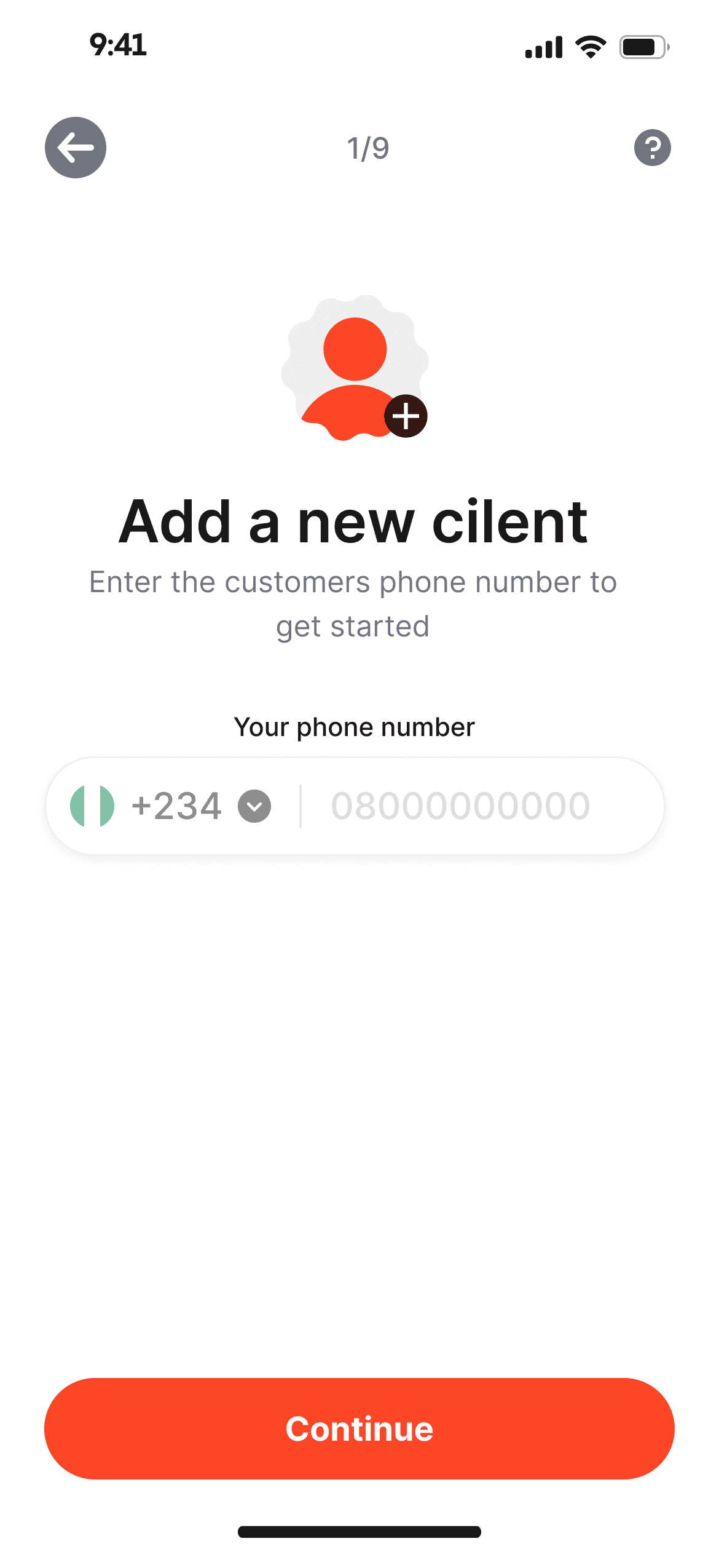
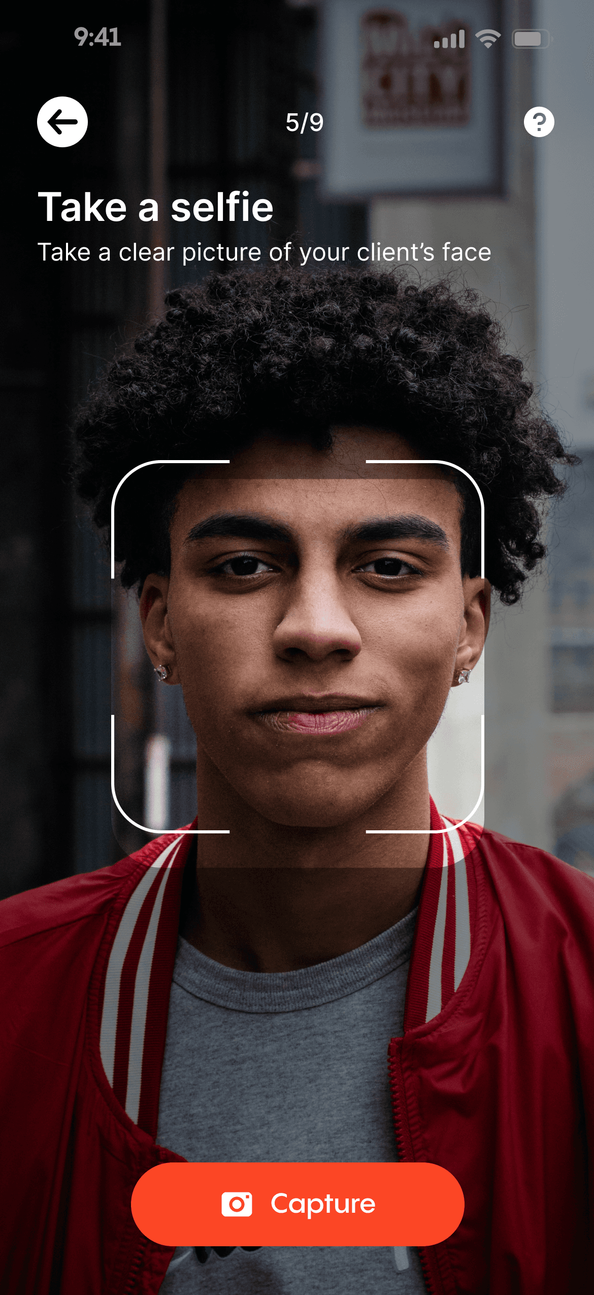
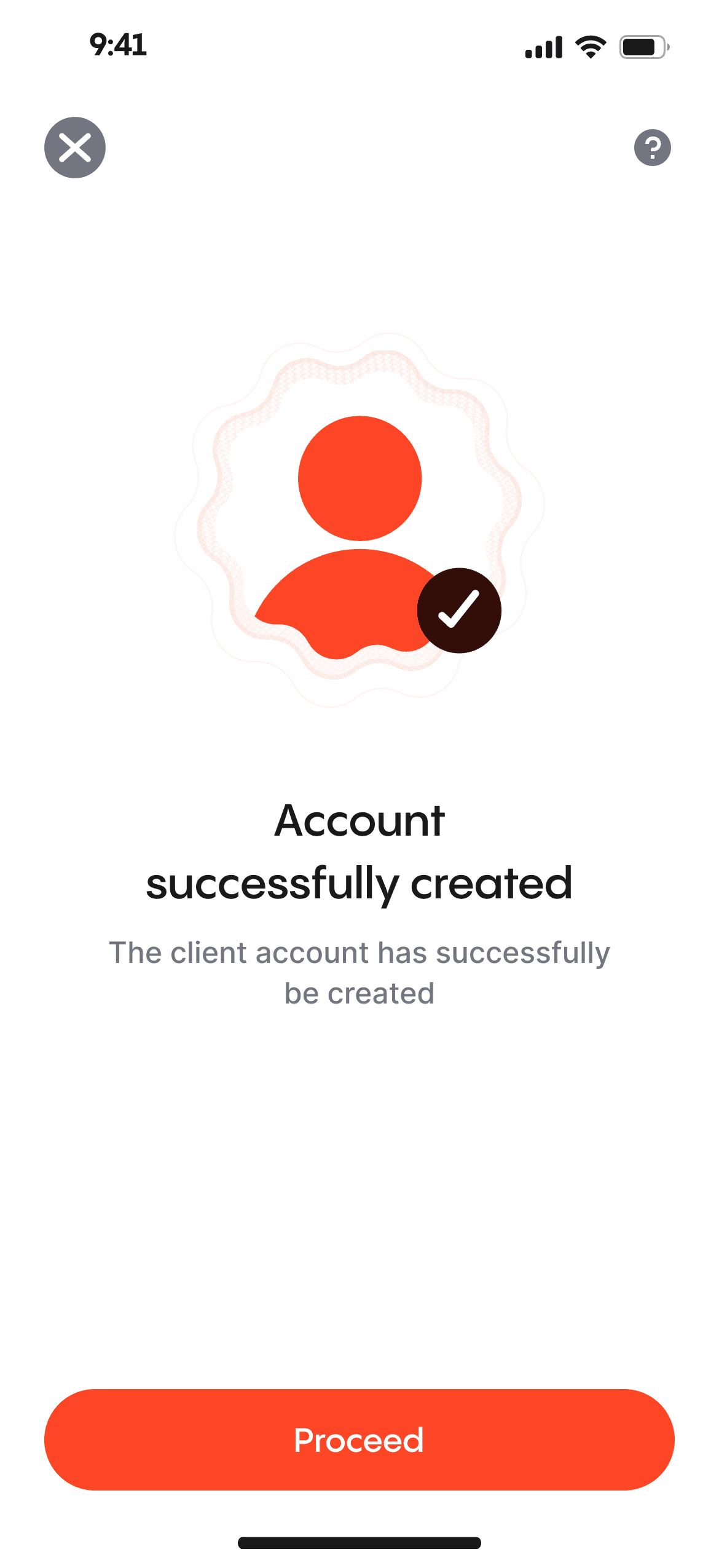
add a Client
The agents can instantly register a client and set up an account for them, which is accessible immediately, in contrast to traditional banks. All they need is the client's phone number, personal details, and a selfie to get started.
Customer management
Agent can easily manage the customer's account from the profile page
All the possible action that can be taken by the customer can be accessed on the profile page. Having a single source of trust is very helpful to the user experience
Personal account manager
To empower agents to serve as personal account managers, assisting with everyday financial tasks such as deposits, withdrawals, savings, and loans. Users can easily have access to traditional Ajo savings and a loan service based on community trust and individual loan history.
To enhance security and prevent fraud, we utilize SMS and OTP codes for customer account authorization.
Since the customers are not operating this app directly, it is important to safeguard their account and prevent any form of fraud that might be attempted by the agent of the agent's staff.
OTP authentication
The agents cannot execute any type of action on the user's account without permission from the user. This permission is commonly delivered via SMS
Moni Reward
Agents can earn rewards as to provide financial services at the grassroots level, this is to keep them motivated as they help bank the unbanked.
We incentivized some of the key actions on the app to reward as they provide fiancial service to people.
During my extensive exploration, I serendipitously stumbled upon a treasure trove of remarkable design styles that ingeniously incorporated the utilization of jagged circles. These captivating visual elements, meticulously integrated into Moni's interface, bestow upon the app a truly distinctive look and feel that is incomparably unique to its brand identity.
By weaving the sharp edges and organic curves of jagged circles helps to achieve a harmonious balance between dynamism and elegance.
By promoting economic inclusion, fostering financial literacy, ensuring security, and rewarding agents, our project aims to create a more inclusive financial ecosystem that benefits all stakeholders.
Financial Inclusion
The app bridges the gap between the unbanked population and formal financial services, allowing them to manage their accounts, save, and access loans.
Rewarding Agents
This motivates them to continue serving their communities, creating a win-win situation.
Customized finance
This enables agents to offer individualized financial guidance & bespoke assistance to individuals
Empowering Agents
Agents can provide vital financial services to their communities. This not only generates income for agents but also positions them as trusted financial advisors
LET'S MAKE MAGIC HAPPEN!
Get in touch and let's create something amazing together!